Design comparison
SolutionDesign
Solution retrospective
any feedback is appreciated!
Community feedback
- @hyrongennikePosted over 2 years ago
Hi @Jcorrales07,
Congrats on completing the challenge
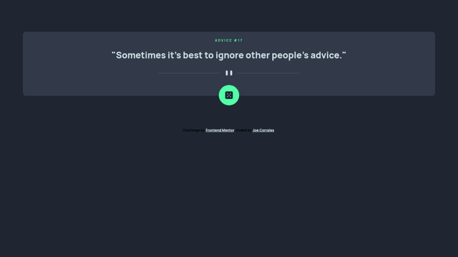
You can add the following it's basically just to center the card on the page.
ody {
    display: flex;
    flex-direction: column;
    align-items: center;
    justify-content: center;
    min-height: 100vh;
}

main.main-container {
    max-width: 500px;
}
Hope this is helpful.
0
Please log in to post a comment
Log in with GitHubJoin our Discord community
Join thousands of Frontend Mentor community members taking the challenges, sharing resources, helping each other, and chatting about all things front-end!
Join our Discord
