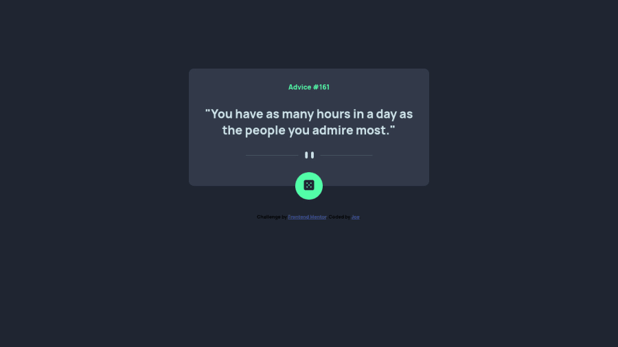
Design comparison
Solution retrospective
Hi All,
Please check my solution here.
Community feedback
- @isprutfromuaPosted over 2 years ago
Hi there. You did a good job 😎
keep improving your programming skills🛠️
your solution looks great, however, if you want to improve it, you can fix these points: ✅ pay attention to the automatic report on your solution. you need to fix html and a11y errors
✅ You Need to Stop Targeting Tags in CSS. When you add CSS directly on tags, your markup can’t change. Your style is tightly coupled to your DOM, and any change increases the risk of breaking things.
✅ it's bad idea to rerender the whole card. You could update only quote number and text
I hope my feedback will be helpful. You can mark it as useful if so 👍
Good luck and fun coding 🤝⌨️
Marked as helpful1@SuprefunerPosted over 2 years agoHi @isprutfromua,
Thanks for your comment!
- fixed the html and a11y errors by changing the class container into a main tag and adding aria-label="Button to render new advice" to the <button>
- Well noted, I only target html and body in my CSS, or there is a better way to do?
- Fixed, instead rerendering the whole card, just rerender the data by using .textContent
Again, thanks for your comment!
0@isprutfromuaPosted over 2 years ago@Suprefuner sorry, my mistake. I meant identifiers
#btn-change {In everyday work, already set ID selectors require the use of inline styles and !important rules. But afterwards there are no more doors open for further refactoring.
I'm really happy that I was useful for you =)
Cheers ,peace and happy coding
0 - @ccreusatPosted over 2 years ago
Hi ! Good job there :)
As @isprutfromua said, fix your html and a11y issues. Take care of his advices too.
For the positioning on your component, you are using Flex on
<body>withflex-direction:column. It lacks of centering because when usingflex-direction:column, the "axis" changed.align-items: centeris not positioning on the Y axis but on the X axis. So to fix your design, addjustify-content: center;to center your component on the Y axisHope it will help :)
Enjoy coding!
Marked as helpful0@SuprefunerPosted over 2 years agoHi @ccreusat,
Thanks for your comment!
Since I was trying to do mobile first, I totally forgot to check how it looks on desktop mode. Fixed and thanks!
0
Please log in to post a comment
Log in with GitHubJoin our Discord community
Join thousands of Frontend Mentor community members taking the challenges, sharing resources, helping each other, and chatting about all things front-end!
Join our Discord
