Solution retrospective
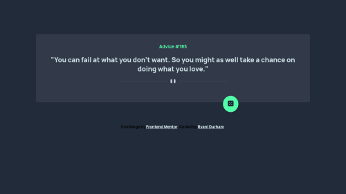
Does anyone have any tips for centering my button without relying on margin? I used margin-left because that's just what ended up working for me, but I'm curious as to what best practice would be for that. Any and all constructive feedback welcome!
Code
Loading...
Please log in to post a comment
Log in with GitHubCommunity feedback
No feedback yet. Be the first to give feedback on Ryani Durham's solution.
Join our Discord community
Join thousands of Frontend Mentor community members taking the challenges, sharing resources, helping each other, and chatting about all things front-end!
Join our Discord