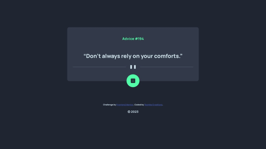
Design comparison
SolutionDesign
Solution retrospective
Very fun!! Nice to take on simple yet exciting projects once in a while
Any criticism is welcome.
Plan on adding additional functionality, so check out my codebase if interested!
Community feedback
- @OneManBannedPosted about 1 year ago
Hi Techkie. Your solution looks really nice. Here are some of my observations.
HTML
- You need to change the <h3> to a <h1>. Every page needs a h1 tag and the heading tags should be used in order. (so you can't use a h3 unless you have a h2 and a h1)
- The "Image Button" <img> needs to be inside a <button> element.
- I would also suggest you change your <div "card"> to a <main> element. The mdn docs on <main> suggest "The <main> HTML element represents the dominant content of the <body>">.
CSS
- Set the width of your ".card" container to 90% and underneath it set a
max-width: 50rem- you can play with how big you want it. That should stop your container shrinking too fast on mobile layouts. - I would also suggest using relative units - such as rems - instead of pixels here is a site that lets you easily convert them.
I'm not too familiar with using jquery. But your javascript code looks nice and clean and it all works properly.
Hope you find some of that useful. Well done!!
Marked as helpful0@Techkie-CreationsPosted about 1 year agoThanks for the advice.
I implemented your suggestions and it works and looks way better than before.
I'll keep in mind your advice on the HTML structuring
0
Please log in to post a comment
Log in with GitHubJoin our Discord community
Join thousands of Frontend Mentor community members taking the challenges, sharing resources, helping each other, and chatting about all things front-end!
Join our Discord
