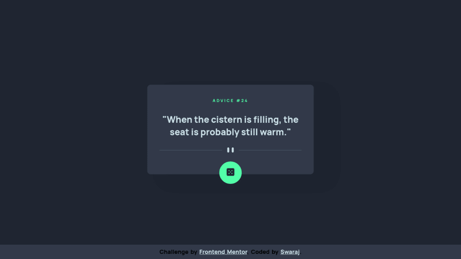
Design comparison
SolutionDesign
Solution retrospective
It turned out to be pretty good visually, but I need serious help and practice arranging sass files. Let me know where I could've improved in CSS by writing more straightforward, better, and less redundant code.
Community feedback
- @0xabdulkhaliqPosted over 1 year ago
Hello there 👋. Congratulations on successfully completing the challenge! 🎉
- I have other recommendations regarding your code that I believe will be of great interest to you.
BUTTONS 🖲️:
- This solution has generated accessibility error reports due to lack discernible text for
<button>
element
- The
<button>
must have discernible text that clearly describes the destination, purpose, function, or action for screen reader users.
- Screen reader users are not able to discern the purpose of elements with role="link", role="button", or role="menuitem" that do not have an accessible name.
- The
<button>
name rule has five markup patterns that pass test criteria:
<button id="al" aria-label="Name"></button> <button id="alb" aria-labelledby="labeldiv"></button> <div id="labeldiv">Button label</div> <button id="combo" aria-label="Aria Name">Name</button> <button id="buttonTitle" title="Title"></button>
-
Ensure that each
<button>
element and elements withrole="button"
have one of the following characteristics:- Inner text that is discernible to screen reader users.
- Non-empty
aria-label
attribute. aria-labelledby
pointing to element with text which is discernible to screen reader users.role="presentation"
orrole="none"
(ARIA 1.1) and is not in tab order (tabindex="-1"
)
I hope you find this helpful 😄 Above all, the solution you submitted is great !
Happy coding!
Marked as helpful0
Please log in to post a comment
Log in with GitHubJoin our Discord community
Join thousands of Frontend Mentor community members taking the challenges, sharing resources, helping each other, and chatting about all things front-end!
Join our Discord