Design comparison
SolutionDesign
Community feedback
- @ArpadGBondorPosted 9 months ago
Hi,
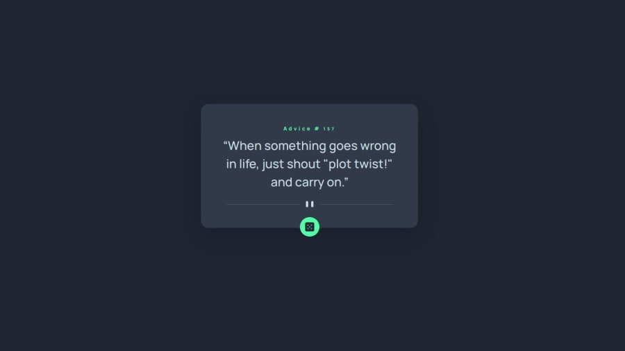
I think it is a good start, but there are some obvious differences between your solution and the original design.
Some examples:
- The green circle behind the dice should be larger.
- The corners of the component should be rounded more.
- The title and the text should be bold.
- There should be quote marks around the advice.
I wish you good luck with the improvements, and keep up the good work! :)
Marked as helpful0
Please log in to post a comment
Log in with GitHubJoin our Discord community
Join thousands of Frontend Mentor community members taking the challenges, sharing resources, helping each other, and chatting about all things front-end!
Join our Discord
