Design comparison
SolutionDesign
Solution retrospective
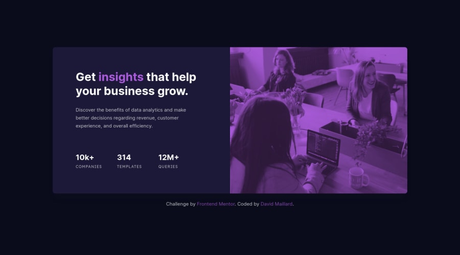
I tried to do an adaptative module. I don't know if I did the right choice but it looks right to me. For the responsive of the image, it may look a little weird but I chose to keep the focal point on the smiling woman.
I am open for other points of view :)
Community feedback
Please log in to post a comment
Log in with GitHubJoin our Discord community
Join thousands of Frontend Mentor community members taking the challenges, sharing resources, helping each other, and chatting about all things front-end!
Join our Discord
