Design comparison
Solution retrospective
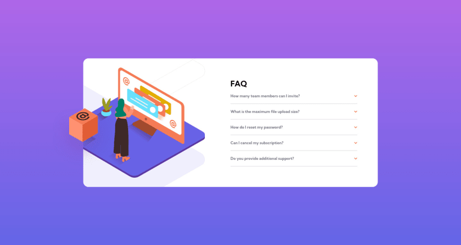
I finished the javascript part in less than 10 minutes but positioning the illustration took me more than 10 hours i finally had to look at someone`s solution. Please suggest how i can do that. Thank you :)
Community feedback
- @grace-snowPosted almost 3 years ago
Hi there
I’ve only had chance to have a very quick look at your code and I can see some issues straight away that you need to fix and learn from
Firstly, this is inaccessible at the moment. The html needs to change so interactive behaviour is triggered by interactive elements. The correct way to do this would be to have each question be
h2 > button > text + img
. The event listener goes on the button.Always use interactive elements for click events like this. And always make sure they have a visible hover and focus-visible style (focus visible should be really obvious)
In your css (scss) stop nesting. You are drastically increasing css specificity at the moment and that will cause all sorts of problems, especially in larger projects. You would never write css like that, and it’s important to write scss in a way that outputs css exactly how you would want to write it.
As a general rule, only nest
- pseudo elements or states (eg.
&:before
or&:focus
) - media queries
That will keep your css specificity nice and low/flat
Never ever put font sizes in px. Use rem (or sometimes em) to ensure correct scaling for all users
I’m aware the design of this is not accessible so that’s how it’s built, but as an aside 12px is too small a text size for anything other than 1-2 words. I would challenge any designer to enlarge the font size and 99% of the time they will agree
Nice work on the JavaScript in this 😎
Good luck
Marked as helpful1@mikib0Posted almost 3 years ago@grace-snow I have fixed the hover issue and you are right it didn't get applied because of too much nesting, i changed the event listener to be on a button and i also changed the font size to rem. I will take note of not nesting too much in my future projects and thank you so much for your feedback i really appreciate.
1 - pseudo elements or states (eg.
- @brodiewebdtPosted almost 3 years ago
I used absolute positioning to do mine. It took a lot of trial and error to get it close to the design. Your looks good. Kevin Powell said using positioning should be the last thing you use, so there must be a better way. The more you practice the easier it will become. I have learned a lot in the past few months from all the projects I have worked on.
2
Please log in to post a comment
Log in with GitHubJoin our Discord community
Join thousands of Frontend Mentor community members taking the challenges, sharing resources, helping each other, and chatting about all things front-end!
Join our Discord