Design comparison
Solution retrospective
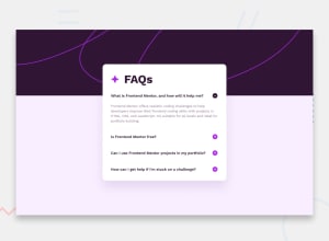
Hey, It's my first project on Frontendmentor where i used JavaScript. I'm very happy of progres i'm making by doing this exercises. Happy to hear what i can improve in my code.
Regards Sebastian
Community feedback
- @piushbhandariPosted 11 months ago
- use
.questions:last-child{}
to remove the border + bottom margin/padding from the last question - any reason why
<div class="question">
isn't a button element? right now i can't use your component with my keyboard. using semantic elements is always a good thing. there are more accessible things you can do but replacing it with a button element is a good start - assign classes instead of setting inline styles. i.e add active to the answer and give it
display:flex;
- if this
<div class="title">
is being used as your main title replace the the div with <h1>
Marked as helpful1@SebBudynskiPosted 11 months agoHello @piushbhandari ! Thank you for all advices. I made corrections right away but one i didn't understand. Can you tell me more about : assign classes instead of setting inline styles. i.e add active to the answer and give it display:flex; ?
Regards Sebastian
0@piushbhandariPosted 11 months ago@SebBudynski so for example, what you would do is, in your css, have a class like so
.active { display: block; }
instead of doing this in javascript, for example,element.style.display='block';
you can instead do this:when the accordion question button is clicked/opened, add the .active class to the button + content. then when you click on it again, remove the .active class. about the same thing what you're doing currently but instead using css classes to hide/show the accordions.
you would be adding/removing the .active class on both your .question button element and .answer paragraph element. likely you may need to update your styles
example code of what i did in my project:
if (accordionBtn.classList.contains("active")) { accordionBtn.classList.remove('active'); } else if (!accordionBtn.classList.contains("active")) { accordionBtn.classList.add('active'); }
you can see my JS to get a better understanding. hope this helps https://github.com/piushbhandari/faqaccordion/blob/main/script.js
Marked as helpful0@SebBudynskiPosted 11 months ago@piushbhandari
Your solution help me understand how exactly my code is working. Now I see that creating a class in css and toggling it does a great job:
const acc = document.getElementsByClassName("question");
let i;
for (i = 0; i < acc.length; i++) { acc[i].addEventListener("click", function () { this.classList.toggle("active");
let hidden = this.nextElementSibling; hidden.classList.toggle("hidden");
}); }
Thanks for looking in my code, it's help me a lot.
0 - use
- @nadun-dhananjayaPosted 11 months ago
Hello 👋. Congratulations on successfully completing the challenge! 🎉
I have additional recommendations regarding your code that I believe will greatly interest you.
-
I noticed that you had set body { max-width: 38px }. Setting a max-width for the body is not a good practice. Instead, you can add a child element and set a max-width for that child element.
-
According to your HTML code structure, you can set a max-width for the main element.
CSS Changes :
body { background-image: url(assets/images/background-pattern-desktop.svg); background-color: var(--Light-pink); background-repeat: no-repeat; background-size: 100%; font-family: "Work Sans", sans-serif; min-height: 100vh; display: flex; align-items: center; } main{ max-width: 38rem; }
- Now you have to center the according card. But if you use
display: flex; align-items: center; justify-content: center;
-
it compresses its child element as much as possible. and when you expand the question, the card width will increase. As a solution, you can set a fixed width for the main tag. But the issue with that is making it responsive is a challenge for you.
-
Therefore, we can use position: absolute instead of flex box.
body { background-image: url(assets/images/background-pattern-desktop.svg); background-color: var(--Light-pink); background-repeat: no-repeat; background-size: 100%; font-family: "Work Sans", sans-serif; min-height: 100vh; } main { position: absolute; transform: translateX(-50%); top: 30%; left: 50%; max-width: 40rem; width: 100%; padding: 0 1rem; } .content { background-color: white; border-radius: 0.6rem; padding: 1.5rem; width: 100%; } @media screen and (max-width: 1280px) { main { top: 18%; } } @media screen and (max-width: 768px) { main { top: 10%; } } @media screen and (max-width: 450px) { main { top: 7%; } }
- Here you can see that I have set specific top positions for different screen sizes. Because if we place It in the center of the screen when we expand the question, it expands both the top and bottom of the card. It's not a good visual experience here. If you set specific top positions, the card will only expand from the bottom. That's better.
I hope it was helpful, you are great, keep up the good work 👍
Happy coding! 😎😎😎
Marked as helpful0@SebBudynskiPosted 11 months agoHi @nadun-dhananjaya,
I implement your suggestions and now it's look much better. Also before didn't understand why widht is increasing and now everything is clear for me.
thanks a lot :)
0 -
- @MelvinAguilarPosted 11 months ago
Hello there 👋. Good job on completing the challenge !
I have other suggestions about your code that might interest you.
-
The repository is set to private or it doesn't exist.
-
t's not necessary to have an
<h2>
inside a button;<h2>
elements are important headers. Place the text directly in the button and transfer its styles to the button. -
Ensure that the entire button has a
cursor: pointer
not only the icon, because clicking in the white space between the text and the icon could expand the accordion. Therefore, it should have a pointer cursor. -
The JavaScript code is excellent.
I hope you find it useful! 😄
Happy coding!
Marked as helpful0@SebBudynskiPosted 11 months agoHi @MelvinAguilar,
I made corrections right away. Also made repository accessible.
Thank you for advice, they helped me to improve my code and make learning much easier.
Regards
1 -
- @danielmrz-devPosted 11 months ago
Hello @SebBudynski!
You did a very good job there!
I have just one suggestion for improvement:
- Since the question and the plus icon are clickable elements, it's nice to add
cursor: pointer
to them. It gives the user a visual indication that the element is clickable.
I hope it helps!
Other than that detail, you did a great job!
Marked as helpful0@SebBudynskiPosted 11 months agoHi @danielmrz-dev,
Thank you for your comment, it's very helpful.
I added pointer and now it's look much nicer.
Regards!
1 - Since the question and the plus icon are clickable elements, it's nice to add
Please log in to post a comment
Log in with GitHubJoin our Discord community
Join thousands of Frontend Mentor community members taking the challenges, sharing resources, helping each other, and chatting about all things front-end!
Join our Discord