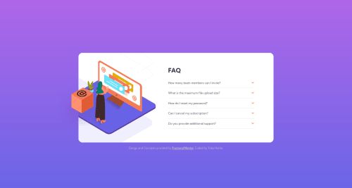
Design comparison
Solution retrospective
I have updated the solution for this challenge on 1st September 2021.
Community feedback
- @vanzasetiaPosted about 3 years ago
👋Hi Sloth!
Thanks for leaving kind words on my solution!
I can close the panel that I opened, in my opinion there's nothing wrong with it.
Some feedback on this solution:
- For the icon arrows, they are decorative images. You can add
aria-hidden="true"
and leave thealt=""
. - For
padding
,margin
,gap
, I recommend to userem
orem
units instead of%
. The reason for that is, you can't limit themax padding
, which means it might not be looking good on wide screen. - Also
640px
is too early to change the layout into two columns. - Try to do this challenge using JavaScript, since the non JavaScript version is just additional challenge.
That's it! Hopefully this is helpful!
Marked as helpful0@Sloth247Posted about 3 years ago@vanzasetia Thank you very much for your feedback! I meant closing all other panels when one panel is open, but I guess I need to use JavaScript to make this work.
I will reflect your advice and will update my solution. Thank you very much 😊
0 - For the icon arrows, they are decorative images. You can add
- @grace-snowPosted over 3 years ago
Hi this needs quite a lot more work, including making it look good on all screen sizes.
Look up how to build "inclusive collapsible sections". There are some good resources out there.
Good luck
1
Please log in to post a comment
Log in with GitHubJoin our Discord community
Join thousands of Frontend Mentor community members taking the challenges, sharing resources, helping each other, and chatting about all things front-end!
Join our Discord