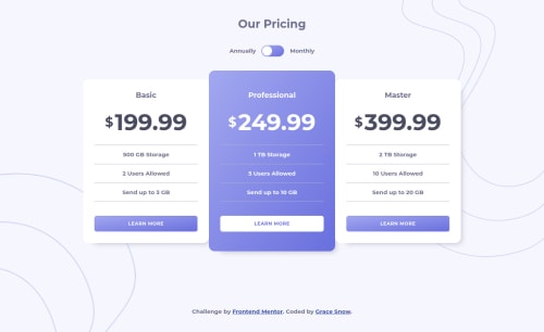
Submitted about 5 years agoA solution to the Pricing component with toggle challenge
Accessible toggle in HTML, CSS and JS with explanatory notes
@grace-snow

Solution retrospective
Using accessible component from: https://github.com/scottaohara/a11y_styled_form_controls
This repo should provide explanatory notes on how and why the toggle was built like that.
Includes:
- fully accessible toggle switch
- javascript to toggle a class to show/hide the correct prices
- responsive (clamped) font sizes
- mobile first design
Ideally, this sort of component should read dynamic data and insert the prices in rather than hard-coding in HTML. But I don't have time for all that today!
Let me know if anything's broken :)
Code
Loading...
Please log in to post a comment
Log in with GitHubCommunity feedback
No feedback yet. Be the first to give feedback on Grace's solution.
Join our Discord community
Join thousands of Frontend Mentor community members taking the challenges, sharing resources, helping each other, and chatting about all things front-end!
Join our Discord