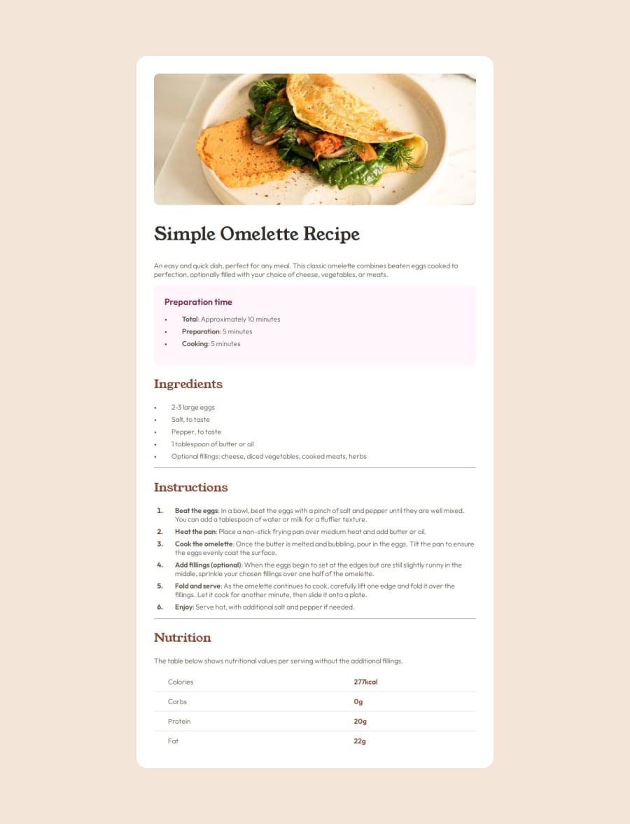
Design comparison
Solution retrospective
I was pretty happy with how accessible I was able to get the page. It also seems pretty close to the design. I probably would use classes rather than experimenting with just HTML tag selection for the CSS.
What challenges did you encounter, and how did you overcome them?I was a little unsure about accessible fonts and sizing, but I was able to figure it out with this article.
What specific areas of your project would you like help with?- Is my HTML semantic and properly structured? Are there any unnecessary divs or better tag choices?
- How's the organisation of my CSS? Could I improve the grouping or ordering of my styles?
- Are there any repetitive patterns in my code that could be simplified?
- Does the site work well with keyboard navigation?
- Have I used CSS variables (custom properties) where it makes sense?
- Is my use of media queries appropriate for responsive design?
- Are there any unnecessary or conflicting styles?
- Does the site look and function consistently across different browsers?
- Have I used any CSS properties that might need prefixes or fallbacks?
- Am I following current CSS and HTML best practices?
Community feedback
- P@StroudyPosted 7 months ago
Hey, Great job with this solution you should be proud, A few things I noticed,
- Missing a
<meta>description tag for SEO purposes, - Setting a height and width attribute to your
<img>will increase performance to reduce layout shifts and improve CLS, It reserves the space on the page for the image, - It is best practice to have a
<main>tag inside your body highlighting the main section. - Your heading elements are not in a sequentially-descending order,
<h1>``<h3>``<h2>, Should be<h1>``<h2>``<h3>``<h4>, You can have multiple<h2>but they have to be in order, Properly ordered headings that do not skip levels convey the semantic structure of the page, making it easier to navigate and understand when using assistive technologies. - You should apply a full modern reset to make things easier as you build, check out this site for a Full modern reset
- Using a naming convention like BEM, Using proper naming will prepare you for the changes in design of the website.
- Check out this article from a Frontend mentor dev about responsive-meaning.
Great to see you using relative units
rem&em, I hope you found some of this information helpful, You should give the articles a good read and I look forward to seeing some more from you, Happy coding! 💻Marked as helpful1 - Missing a
Please log in to post a comment
Log in with GitHubJoin our Discord community
Join thousands of Frontend Mentor community members taking the challenges, sharing resources, helping each other, and chatting about all things front-end!
Join our Discord
