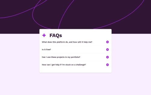
Accessible React FAQ Accordion with TypeScript, and Styled Components

Solution retrospective
I’m most proud of successfully implementing a highly accessible accordion component by following the ARIA Authoring Practices Guide (APG). Ensuring proper use of aria-expanded, aria-hidden, and dynamically managing focusable child elements with a custom hook was a rewarding challenge. Balancing this with smooth animations using Framer Motion pushed me to think critically about how accessibility and interactivity can coexist.
What I would do differently next time is experiment with Tailwind CSS instead of Styled Components for managing dynamic styles. While Styled Components gave me a lot of flexibility, I found some of the dynamic styling patterns could have been handled more efficiently and cleanly with Tailwind's utility-first approach. Additionally, I would explore more advanced animation techniques to further refine the transitions and optimize performance.
What challenges did you encounter, and how did you overcome them?One of the biggest challenges I faced was combining smooth animations with accessibility requirements. Initially, I used display: none to hide the content panels when collapsed, but this approach disrupted the animations. Dynamically removing the content panel based on the isOpen state wasn’t an option either, as the panel needed to remain in the DOM for the button's aria-controls attribute to function correctly. To solve this, I animated the height and opacity of the panels using Framer Motion while toggling aria-hidden to ensure accessibility.
Another challenge was managing focusable child elements when a panel was hidden. Hidden content should not be reachable via keyboard navigation, so I created a custom hook to dynamically remove child elements from the tab order when the panel was collapsed. This solution ensured a smooth and accessible keyboard navigation experience.
Lastly, as someone relatively new to TypeScript, I encountered friction with type definitions and state management. By researching TypeScript best practices and iteratively refining my implementation, I built confidence in writing clean, type-safe code that improves scalability and readability.
These challenges pushed me to think critically about accessibility, animations, and modern React patterns, leading to a solution that I’m proud of.
What specific areas of your project would you like help with?I would love feedback on two key areas of my implementation:
-
TypeScript Usage
As someone still learning TypeScript, I’m keen to hear if my approach to type definitions and state management could be improved. Are there any areas where my types could be more precise or reusable? -
Accessibility and Animations
I encountered challenges animating content panels while maintaining accessibility, particularly avoiding the use ofdisplay: nonedue to its disruption of animations. I’d appreciate insights on how others might approach this challenge. Are there alternative techniques or patterns for smoothly animating elements while ensuring they remain in the DOM and accessible?
Any feedback or suggestions on these areas would be greatly appreciated to help me refine my skills further.
Please log in to post a comment
Log in with GitHubCommunity feedback
No feedback yet. Be the first to give feedback on Jessica Moore's solution.
Join our Discord community
Join thousands of Frontend Mentor community members taking the challenges, sharing resources, helping each other, and chatting about all things front-end!
Join our Discord