Submitted over 2 years ago
Accessible rating component with CSS animations
#accessibility
@JulioCinquina
Design comparison
SolutionDesign
Solution retrospective
Hi, everyone! 👋🏻
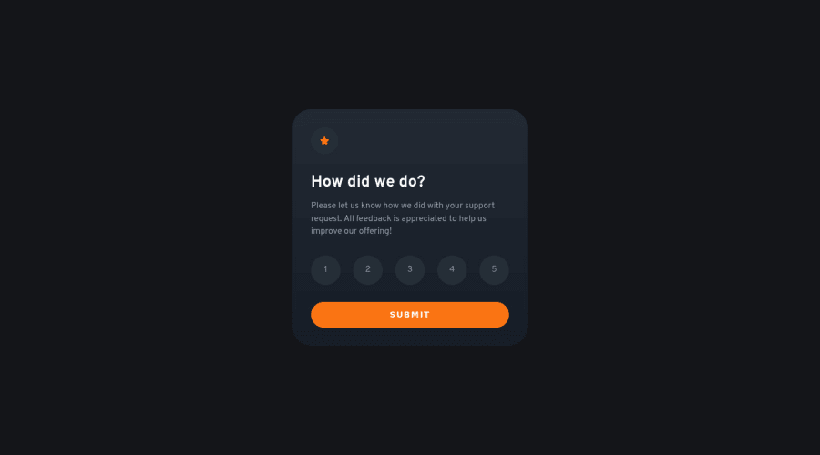
I had fun practicing DOM manipulation in this challenge. My solution features:
- CSS animations between states
- An error message when submitted with no value selected
- Accessibility:
aria-liveattribute,prefers-reduced-motionmedia query, outlines for keyboard navigation, and screen reader focus management via thefocus()method.
Questions:
- The numbers inside the buttons look a little bit off-center vertically. Why? I have centered the radio button + label with Grid, and the
line-heightof the label is equal to the size of the button, so they should be centered. Does this have something to do with the font itself? - Are there any best practices when it comes to styling components and pages for big screens (QHD, 4K)? I'd appreciate any tips and resources about this.
- How can I set up a simple back end to which I could send the ratings and make the form actually work?
Any feedback, comments and suggestions are very welcome and appreciated. Thank you!
Community feedback
Please log in to post a comment
Log in with GitHubJoin our Discord community
Join thousands of Frontend Mentor community members taking the challenges, sharing resources, helping each other, and chatting about all things front-end!
Join our Discord
