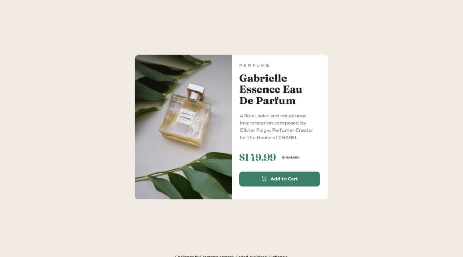
Design comparison
Solution retrospective
I made good progress by incorporating unfamiliar HTML elements to improve accessibility and my knowledge of semantic HTML. I also considered how I wanted users to interact with the UI, using that as a guide to test the app for tab accessibility.
Community feedback
- @StroudyPosted 2 months ago
Amazing job with this! You’re making fantastic progress. Here are some small tweaks that might take your solution to the next level…
-
Using
font-display: swap
in your@font-face
rule improves performance by showing fallback text until the custom font loads, preventing a blank screen (flash of invisible text). The downside is a brief flash when the font switches, but it’s usually better than waiting for text to appear. -
This does not matter that much at this stage but something to be mindful of for SEO(Search Engine Optimisation),
<meta>
description tag missing that helps search engine determine what the page is about, Something like this<meta name="description" content="description goes here" />
-
Using
rem
orem
units in@media
queries is better thanpx
because they are relative units that adapt to user settings, like their preferred font size. This makes your design more responsive and accessible, ensuring it looks good on different devices and respects user preferences.
You’re doing fantastic! I hope these tips help you as you continue your coding journey. Stay curious and keep experimenting—every challenge is an opportunity to learn. Have fun, and keep coding with confidence! 🌟
Marked as helpful0@StroudyPosted about 2 months agoHey @Kellswork, You smashed this challenge to be fair, I struggled to find any feedback my limited knowledge could give, I'm glad it was helpful. See you around 💪
1@StroudyPosted about 2 months agoHey @Kellswork, I'm looking for some points for the wall of fame would greatly appreciate it if you did find it helpful to mark it, Thanks bro!
0 -
- @MikDra1Posted 2 months ago
If you want to make your card responsive with ease you can use this technique:
.card { width: 90%; max-width: 37.5rem; }
On the smaller screens card will be 90% of the parent (here body), but as soon as the card will be 37.5rem (600px) it will lock with this size.
Also to put the card in the center I advise you to use this code snippet:
.container { display: grid; place-items: center; }
Hope you found this comment helpful 💗💗💗
Good job and keep going 😁😊😉
Marked as helpful0 - @justCaioDevPosted 2 months ago
Nice work!
I liked your semantic HTML 👌
1
Please log in to post a comment
Log in with GitHubJoin our Discord community
Join thousands of Frontend Mentor community members taking the challenges, sharing resources, helping each other, and chatting about all things front-end!
Join our Discord