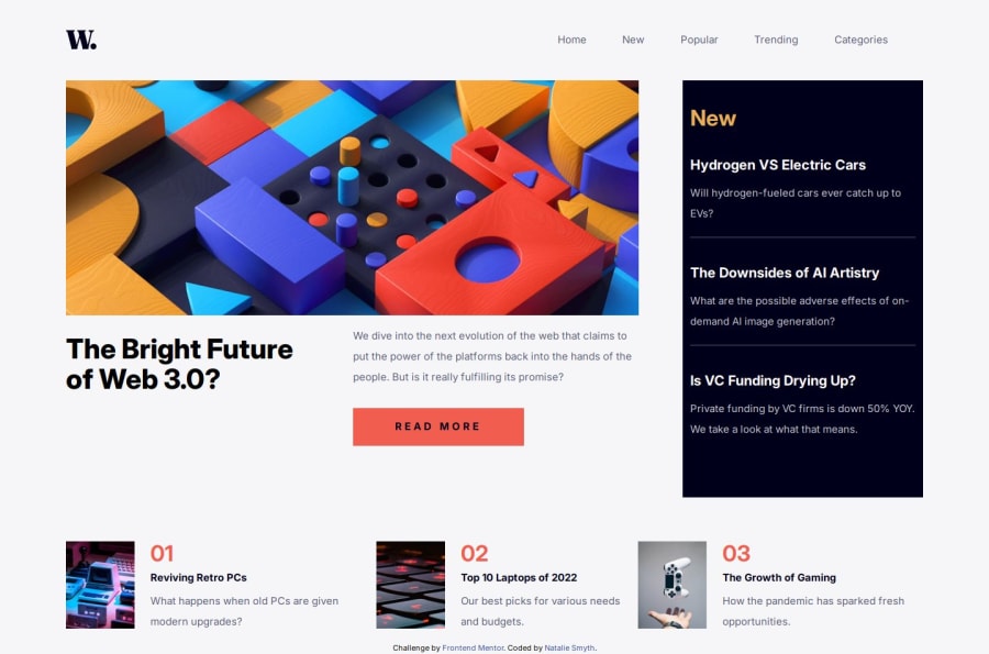
Accessible news homepage built with CSS grid
Design comparison
Solution retrospective
I'm most proud that I (mostly) used CSS grid to build this project. In past projects, I've tried to use grid but got frustrated with it and switched to flex, which I'm much more comfortable with.
What challenges did you encounter, and how did you overcome them?Using grid was the biggest challenge, but I had a bunch of online resources to help me.
What specific areas of your project would you like help with?I am not thrilled with the the button on mid sized screens, it's not the right size but I can't seem to set the max height of the button when the screen is around 700px-1000px.
Community feedback
- @KapteynUniversePosted 5 months ago
Hey Natalie, nice job.
That looks like a grid problem. I see you tried align-items on the button but you should use align-self.
@media (min-width: 62.5rem) {
    .call-to-action {
        grid-area: button;
        align-self: center;
    }
}
You can check for grid tricks on this page
It doesn't look like it on the preview image but nav items also touching eachother on my side. Maybe you changed something after posting solution. Looks like these 2 codes are conflicting eachother
@media (min-width: 62.5rem) {
    .primary-navigation[data-visible='false'] {
        display: flex;
        justify-content: space-evenly;
    }
}
@media (min-width: 62.5rem) { .nav > ul { display: grid; gap: 1px; grid-template-columns: repeat(5, 1fr); justify-self: end; color: hsl( 236 13 42 ); } }Marked as helpful0P@nataliesmythPosted 5 months ago@KapteynUniverse Thanks for the feedback! I'm not very comfortable using grid, and it shows in this project, I was very confused as to why the button was doing that.
0
Please log in to post a comment
Log in with GitHubJoin our Discord community
Join thousands of Frontend Mentor community members taking the challenges, sharing resources, helping each other, and chatting about all things front-end!
Join our Discord
