Submitted 7 months ago
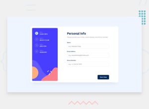
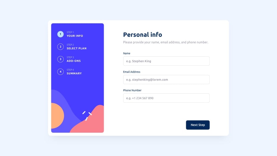
Accessible multi-step form. (React)
#accessibility#react#typescript#vite
P
@Wannika123
Design comparison
SolutionDesign
Solution retrospective
What are you most proud of, and what would you do differently next time?
I think it's accessible enough. I manually test the keyboard navigation.
What challenges did you encounter, and how did you overcome them?Form is one of the first thing most of us learn to build, I think. But it's so hard to get it right.
What specific areas of your project would you like help with?Any comment is welcome.
Community feedback
Please log in to post a comment
Log in with GitHubJoin our Discord community
Join thousands of Frontend Mentor community members taking the challenges, sharing resources, helping each other, and chatting about all things front-end!
Join our Discord

