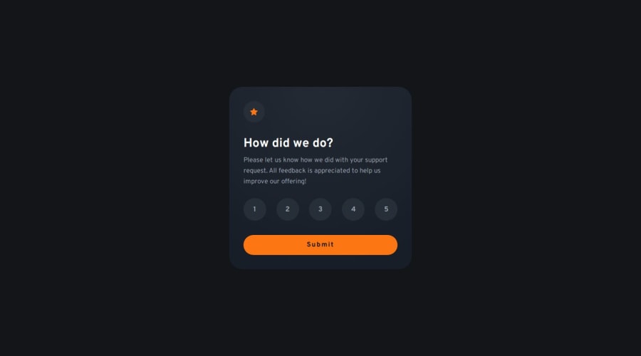
Accessible interactive rating component
Design comparison
Solution retrospective
This was a fun one, tried to focus on making it accessibility driven patterns, primarily focusing on using semantic HTML
proud of the ratings implementation in particular,
What challenges did you encounter, and how did you overcome them?1 2 3 4 5
actively sticking to semantic tags was quite the effort.
What specific areas of your project would you like help with?Any feedback is welcome!!!
Community feedback
- @jjdavenportPosted 11 months ago
The solution looks pretty much identical to the original design, the html is easily readable with good accessibility, and works on all devices and screen sizes. The only differences with the original are some minor styling differences on the active states with background colors. The use of radio buttons are really great, making the JS so much simpler.
Well done!
Marked as helpful0
Please log in to post a comment
Log in with GitHubJoin our Discord community
Join thousands of Frontend Mentor community members taking the challenges, sharing resources, helping each other, and chatting about all things front-end!
Join our Discord
