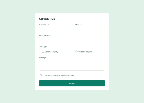
accessible form

Solution retrospective
I am proud that this form could be navigated with the mouse and the keyboard. The form wil be read out loud by screen readers and give information to blind people that they needed to send this form. I am also happy with the little animation at the end that op-ups a message that the form was send correctly.
What challenges did you encounter, and how did you overcome them?In the design the focus and active state would be only changing the border color. It was very difficult to see. I can inmagine that someone with bad sight would not see it. I decided to make the border thicker. Making de form work for people that wil navigate it with the mouse and have good sight wasn't a big problem. Making it accessible with the screen reader is a whole other story. With voiche over on the mac I tested if the code was working for screen readers. I changed the error messages so they were also clear if you only would hear them being read out. Only stars at the end of the input labels wasn't working for people without sight. I used aria-label to turn the message in the name of the field and that it is required.
What specific areas of your project would you like help with?If you have any suggestions to make this form even more accessible I would love to hear it. After trying a lot out it made de code a bit messy in the HTML and CSS do you have tips to make it more organized?
Please log in to post a comment
Log in with GitHubCommunity feedback
No feedback yet. Be the first to give feedback on Jolijn Rosendaal's solution.
Join our Discord community
Join thousands of Frontend Mentor community members taking the challenges, sharing resources, helping each other, and chatting about all things front-end!
Join our Discord