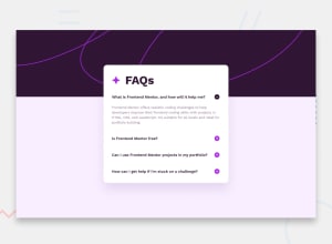
Design comparison
SolutionDesign
Solution retrospective
What are you most proud of, and what would you do differently next time?
Beginning the project with accessibility in mind introduced me to the details and summary tag which made the whole project easier
proud of this html for a single accordion
          What is Frontend Mentor, and how will it help me?


          Frontend Mentor offers realistic coding challenges to help developers improve their
          frontend coding skills with projects in HTML, CSS, and JavaScript. It's suitable for
          all levels and ideal for portfolio building.
and the associated css
details > summary {
    list-style: none;
    cursor: pointer;
    font-size: var(--summary-size);
    font-weight: 600;
    color: var(--heading-color);
    display: flex;
    justify-content: space-between;
    gap: 1rem;
}
details > summary:hover {
    color: var(--summay-hover-color);
}
.summary-icon {
    width: var(--summary-icon-dimension);
    height: var(--summary-icon-dimension);
    background-image: url(./assets/images/icon-plus.svg);
    background-repeat: no-repeat;
    background-size: contain;
    flex-shrink: 0;
}
details[open] > summary .summary-icon {
    background-image: url(./assets/images/icon-minus.svg);
}
details > p {
    margin-top: 1.5rem;
    font-size: var(--details-size);
    color: var(--details-color);
    line-height: var(--details-line-height);
}
Nothing much
What specific areas of your project would you like help with?Any feedback is welcome!!!
Join our Discord community
Join thousands of Frontend Mentor community members taking the challenges, sharing resources, helping each other, and chatting about all things front-end!
Join our Discord
