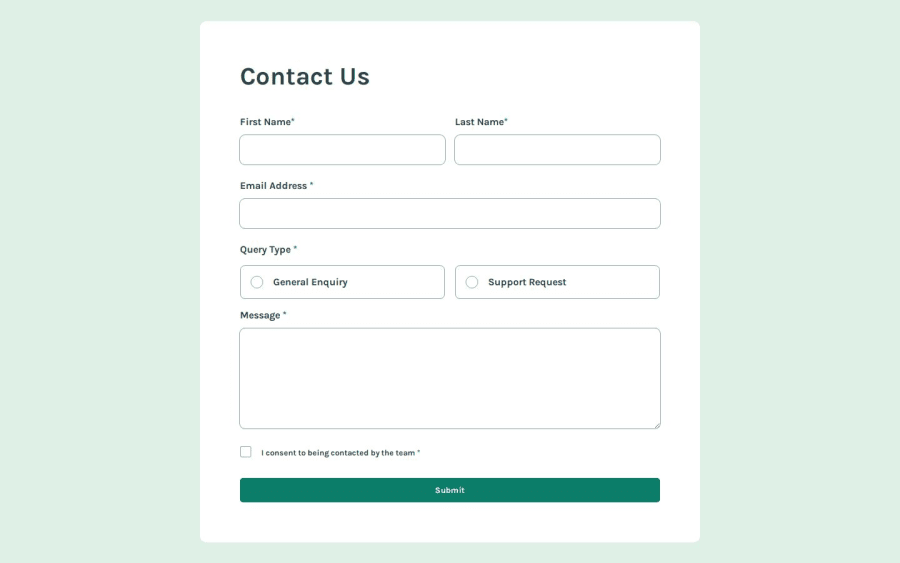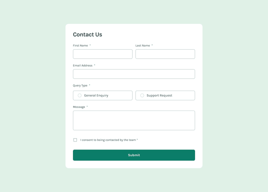
Design comparison
SolutionDesign
Solution retrospective
What are you most proud of, and what would you do differently next time?
Made with:
- HTML 🦴
- CSS 🎨
- JS 🤖
- for practice, I didn't use any libraries this time 🚫🚫
- mobile-first workflow 📲📲
- did my best to make it accessible 🦼
- made the custom buttons keyboard accessible ⌨️
Accessibility is a BIG problem for me. Usually I just don't have the patience to set up everything correctly for it, but this time I tried at least!! ☝️☝️
What specific areas of your project would you like help with?As always, if you notice anything, you know what to do 👇👇
Community feedback
Please log in to post a comment
Log in with GitHubJoin our Discord community
Join thousands of Frontend Mentor community members taking the challenges, sharing resources, helping each other, and chatting about all things front-end!
Join our Discord
