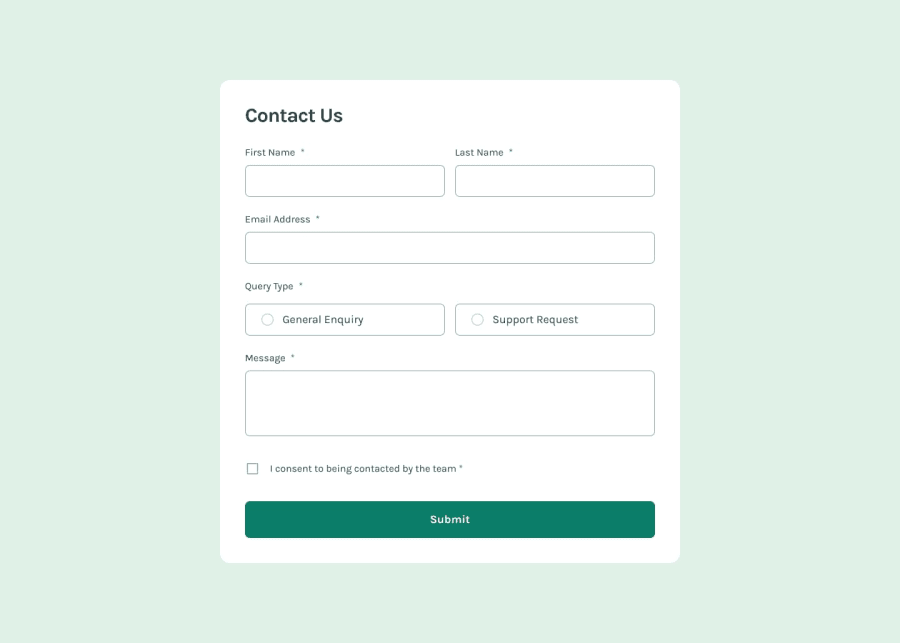
Design comparison
SolutionDesign
Solution retrospective
What are you most proud of, and what would you do differently next time?
I have learnt how to make accessible forms by
- making the form accessible using keyboard
- using autocomplete attribute and different tokens for different input types
- use of different aria-describedby attribute to describe more on what the input field is about and how to input values
- hiding redundant data from screen readers using aria-hidden attribute
- use of aria-invalid attribute to announce field is invalid and the error message based on aria-describedby
- how to make the toast message or modal accessible to the screen readers
- the use of aria-live, role="alert" and aria-atomic attributes help annouce the success message of toast in the solution
I had some issues using aria-invalid attribute and removing error messages when user starts filling forms
- I set the aria-invalid="false" on load in all the input elements, and when there is an error on submit then I changed attribute aria-invalid="true" so that screen-readers announce the input is invalid and error message is read out
- similarly when user starts typing on the input field which has error message, then the error-message disappears
Is my solution accessible? How can I improve the a11y of the solution.
Community feedback
Please log in to post a comment
Log in with GitHubJoin our Discord community
Join thousands of Frontend Mentor community members taking the challenges, sharing resources, helping each other, and chatting about all things front-end!
Join our Discord
