

Design comparison
Solution retrospective
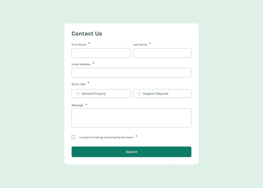
I am most proud of creating a fully accessible and user-friendly contact form with real-time validation and clear error messaging. The form follows best practices, including semantic HTML, ARIA attributes, and a clean UI.
Next time, i would focus more on modularizing the JavaScript validation from the beginning to improve maintainability. I would also explore using a JavaScript framework (such as React) to make the form state management smoother.
What challenges did you encounter, and how did you overcome them?🛑 Challenge: Only the first error message was showing when using .every() for validation.
- ✅ Solution: I switched to
.forEach()to ensure all errors appear simultaneously, improving the user experience.
🛑 Challenge: The :invalid CSS rule didn’t apply when JavaScript handled validation.
- ✅ Solution: I added a custom
.invalidclass in JavaScript to control the styling manually.
🛑 Challenge: Making the form fully accessible for screen readers.
- ✅ Solution: Used ARIA attributes (
aria-describedby,aria-live) to announce errors and success messages properly.
🔹 Validation Performance: My form validation works well, but are there more efficient ways to structure it?
🔹 Accessibility Improvements: How can i further improve keyboard navigation and screen reader support?
🔹 Error Handling Best Practices: Are there better ways to manage error messages dynamically while keeping the code scalable?
Please log in to post a comment
Log in with GitHubCommunity feedback
No feedback yet. Be the first to give feedback on Aydan's solution.
Join our Discord community
Join thousands of Frontend Mentor community members taking the challenges, sharing resources, helping each other, and chatting about all things front-end!
Join our Discord