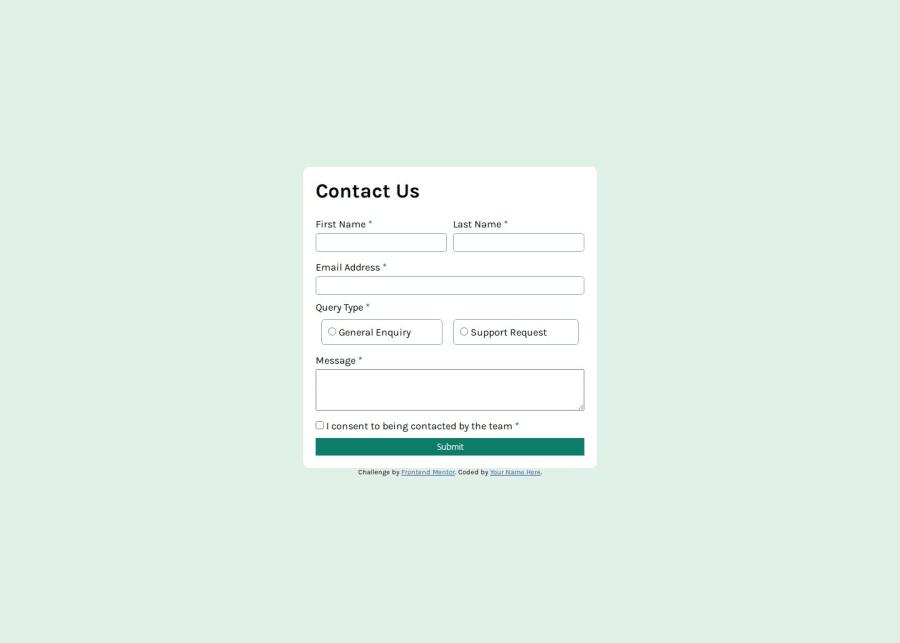


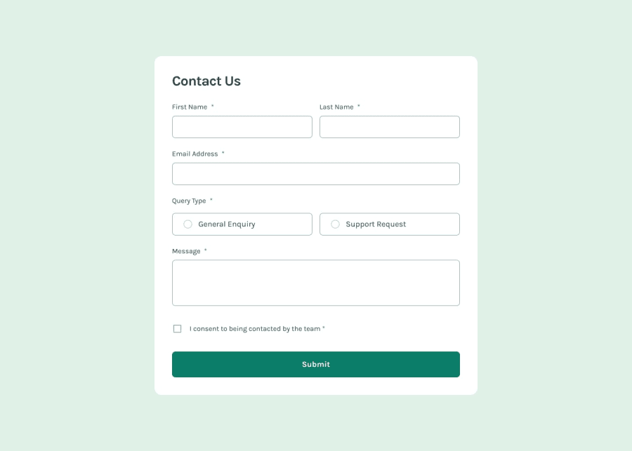
Design comparison
Community feedback
- @BunchydoPosted about 2 months ago
HTML: Accessibility:
You’re using aria-describedby and aria-labelledby, which is great for accessibility. However, make sure that the id attributes you’re referencing (e.g., aria-describedby="nameError1") match the corresponding elements accurately. The fieldset and legend are great for accessibility, and you’re using them well to group form elements. Just ensure that your radio button options within fieldset are adequately described for screen readers. Semantic HTML:
The aria-labelledby on the <form> element is good, but it might be worth including an aria-label for the entire form, or making sure that the h1 element effectively describes the form’s purpose. Favicon Path:
Consider using a relative path like href="assets/images/favicon-32x32.png" in the <link> tag to ensure it's properly linked (you’ve used a mix of forward and backslashes in the file paths). Form Method:
Since your form currently has method="get", it’s important to note that this will append form data to the URL. If you don’t intend to use query parameters, method="post" might be more appropriate for sensitive data or submission without appending it to the URL. JavaScript: Event Handling:
The way you're handling input and focus events for validation is a solid approach. However, consider using a single event listener for each input type instead of adding separate ones for focus and input. This can help reduce redundancy. You could optimize your verifyRadio and verifytextarea functions to be more concise or abstract repeated logic into reusable functions for maintainability. Validation Logic:
You're adding and removing error messages dynamically, which is great. But, be careful about selecting the next element sibling for error messages. For example, input.nextElementSibling.style.display relies on the order of the HTML, so if the structure changes, this could break. When verifying radio buttons, you might want to add some feedback that the fieldset is required even when no option is selected. You’ve got the error message for the radio buttons hidden until they are unselected, but consider showing it immediately when the form is submitted without a valid choice. Event Listener on Submit Button:
Instead of e.preventDefault() on the button, consider calling form.submit() after your validation checks pass if you intend to proceed with actual form submission. Currently, the form won’t submit even if validation is successful, since the preventDefault prevents it. CSS: Responsive Design:
Your media queries and layout adjustments are well-structured! The layout shifts responsively when resizing, especially the form and name section, which makes the form much more user-friendly on smaller screens. Visual Feedback:
The styles for .empty and .fill are visually clear for users, which is a good practice for error handling. You might want to make sure that these visual indicators are also easily distinguishable in terms of color contrast to help users with color blindness or other visual impairments. Form Elements:
Consider adding some padding or margin to the <button> element to make it more clickable and stand out more on the page
Marked as helpful0@Dadv-a11yPosted about 2 months ago@Bunchydo i will apply this change thanks for thé feedback
0

Please log in to post a comment
Log in with GitHubJoin our Discord community
Join thousands of Frontend Mentor community members taking the challenges, sharing resources, helping each other, and chatting about all things front-end!
Join our Discord