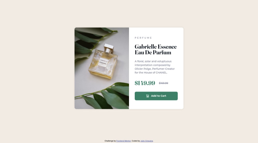
Accessible and responsive product card with Flexbox and media queries
Design comparison
Solution retrospective
The card contains a visually-hidden text intended for screen readers only. I noticed that it will still be copied if I select the entire content of the card. Could this be an issue? Would it be better to position the visually-hidden content off the screen?
What are the best practices about the feedback provided by interactive elements? I made the "add to cart" button shrink slightly in its active state. However, in Firefox, it only shrinks when clicked, but not when the space bar or enter keys are pressed while focused. In Edge, it shrinks when clicked and when the space bar is pressed, but not with the enter key.
Is it correct to say that there is a lack of feedback when the user presses the button with the keyboard (particularly in Firefox)? Should I correct this with JavaScript, changing the browser's default behavior?
Any other comments are welcome! Thank you!
Community feedback
Please log in to post a comment
Log in with GitHubJoin our Discord community
Join thousands of Frontend Mentor community members taking the challenges, sharing resources, helping each other, and chatting about all things front-end!
Join our Discord
