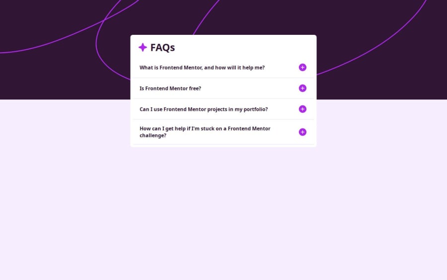

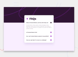
Design comparison

Solution retrospective
I've tried to make this as accessible as possible, however, I'm sure improvements can be made, especially to the JavaScript, which I feel could have been a lot simpler than I've made it.
I'm also kind of unsure as to when to use REMs and when not to. My design doesn't seem to completely match the design. I know to use REMS because people use different font sizes for accessibility, but I feel like I've overused them here.
Community feedback
- @KapteynUniversePosted 4 months ago
Hey Paisley, nice job.
For accesibility, i don't think making the texts tabable is necessary.
I sometimes use pixel for small things like border radius but i think it is ok to use rem for everything. You can use em for some cases like button paddings. Maybe this video helps.
You can also use details for this one.
Marked as helpful0

Please log in to post a comment
Log in with GitHubJoin our Discord community
Join thousands of Frontend Mentor community members taking the challenges, sharing resources, helping each other, and chatting about all things front-end!
Join our Discord