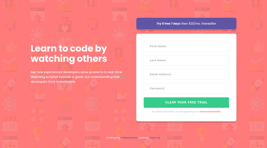
Accessibility friendly and NVDA tested with in-line validation
Design comparison
Solution retrospective
Hi all,
Thanks for checking out my solution!
This one is the one where I decided to read and learn accessibility best practices, WAI-ARIA roles and states/properties and screen readers so if there are any accessibility pros out there, please scrutinize!
From most of what I learned it seems having semantic HTML5 will get you there most of the way, especially for a simple app like this. In fact, I added a lot more aria properties because I wanted to play with the new toys but ended up taking them out.
Originally I had role="form" on the <form> but learned and tested for myself on the NVDA screen reader that having a label on the <form> will automatically promote it as a form landmark, making the role redundant.
Another thing was that aria-required isn't really needed if you already have the HTML required attribute. Although the screen reader will also read 'invalid entry' as soon as you navigate into the input, which apparently screen reader users are used to by now from what I've read.
Speaking of which, there is a lot of intricacies to what and when screen readers will read things that I've discovered. For example, the aria-labelledby property in the <form> will not get read if you navigate by browsing through landmarks which is what I would have expected so screen readers can know what each form is about as they browse through forms, but instead the label is read when you begin editing one of the inputs within the form. Maybe regular screen reader users are already used to this as well and will know instinctively to edit the first form to hear what the form is about.
Quirks like these made it a challenge for me to know whether I've built these incorrectly or if long time screen readers have already adapted to these quirks and there's an unspoken rule that everyone has gotten used to them by now so the unexpected behavior is already standardized. And hopefully most other screen readers read them out similarly enough to NVDA as that is another factor to consider but all in all this was a good learning experience!
Jeremy
Community feedback
Please log in to post a comment
Log in with GitHubJoin our Discord community
Join thousands of Frontend Mentor community members taking the challenges, sharing resources, helping each other, and chatting about all things front-end!
Join our Discord
