Accessibility focused, built w/ SvelteKit, Tailwind

Solution retrospective
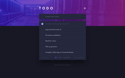
This is my first real attempt at building an accessible project here on FrontendMentor, as such I could use some tips as to what could be improved in this area.
The drag and drop functionality currently only works on desktop since I used an external library, my plan is to learn how to write some custom drag and drop code which is accessible in future.
I am aware that this project fails accessibility on color/contrast issues but I wanted to stick to the design as closely as possible. However if there are issues with focus states, labeling etc then I would be glad to hear about them.
Cheers, Glen
Please log in to post a comment
Log in with GitHubCommunity feedback
No feedback yet. Be the first to give feedback on Glen's solution.
Join our Discord community
Join thousands of Frontend Mentor community members taking the challenges, sharing resources, helping each other, and chatting about all things front-end!
Join our Discord