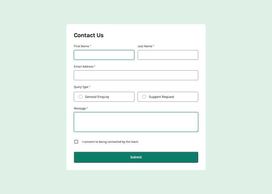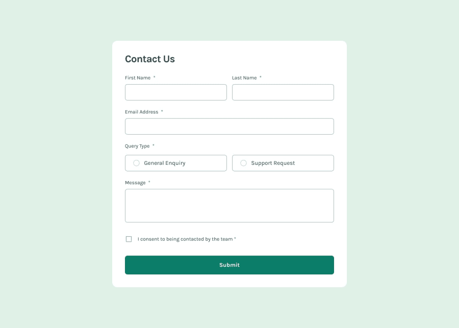
Design comparison
Solution retrospective
I think I did a good job making the form accessible and user-friendly. Next time, I’d like to approach the HTML with accessibility in mind from the beginning, so I can consider everything needed to make websites more accessible for everyone.
What challenges did you encounter, and how did you overcome them?I didn’t know about some of the obstacles that users with visual impairments go through. That’s why I researched how to make the form usable with just the keyboard. It caused me some issues, like navigating between radio buttons, but I was able to search and understand how blind people actually use the keyboard, which helped me overcome the challenges I faced.
Community feedback
Please log in to post a comment
Log in with GitHubJoin our Discord community
Join thousands of Frontend Mentor community members taking the challenges, sharing resources, helping each other, and chatting about all things front-end!
Join our Discord
