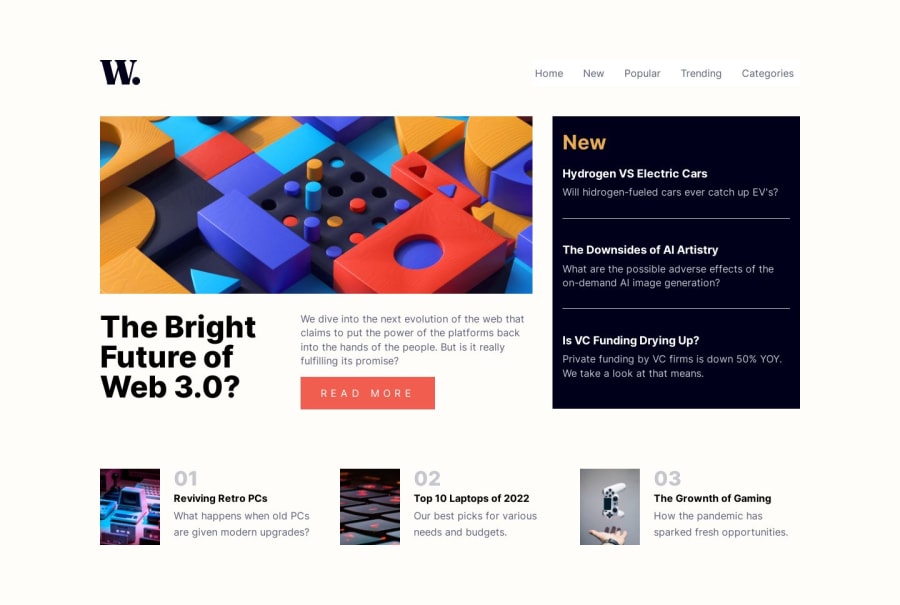
Design comparison
SolutionDesign
Solution retrospective
Simple implementation using HTML, CSS and Vite to handle the development environmeny.
Community feedback
- @jairovgPosted over 1 year ago
Hi Edward, congrats on your solution; here are some comments that might help you to improve it:
Accessibility and semantics
- Here is your heading map:
1 - The Bright Future of Web 3.0? 2 - New 3 - Hydrogen VS Electric Cars 3 - The Downsides of AI Artistry 3 - Is VC Funding Drying Up? 3 - Reviving Retro PCs 3 - Top 10 Laptops of 2022 3 - The Grownth of Gaming
- Even the
New
title has a correct hierarchy, this is the text the assistive technology will read out loud; I would consider an enhanced title with a part for screen readers only like"New articles"
or"New posts"
. - Notice that you have three elements that even belong to an
h3
in its hierarchy, their parent is not correct. - The page title and icon are related to Vite and not to the challenge's scope.
- The
section.top
element misses its heading to enhance the assistive technologies experience. You may use a.sr-only
class so it may be visually hidden. - The same section uses an ordered list to display its
articles
, however, you're using a span to enumerate the items.
Styles
- Nice to see colour variables using their semantic use rather than their colour names, however, some of the colour names are used in some elements.
Others
- The
button.header__menu
andbutton.nav__close
elements might be treated as a single toggle element.
I hope you find it useful. I'm happy to look at your solution if you make other changes.
Marked as helpful0
Please log in to post a comment
Log in with GitHubJoin our Discord community
Join thousands of Frontend Mentor community members taking the challenges, sharing resources, helping each other, and chatting about all things front-end!
Join our Discord