Design comparison
SolutionDesign
Solution retrospective
Please any form of feedback would be appreciated. Also Is there a nicer way i would have written my sass code or its not so bad?
Community feedback
- @ApplePieGiraffePosted about 4 years ago
Hey, nice work, Uririoghene Utobivbi! 👍
Your solution looks good and works well! 🙌
I suggest,
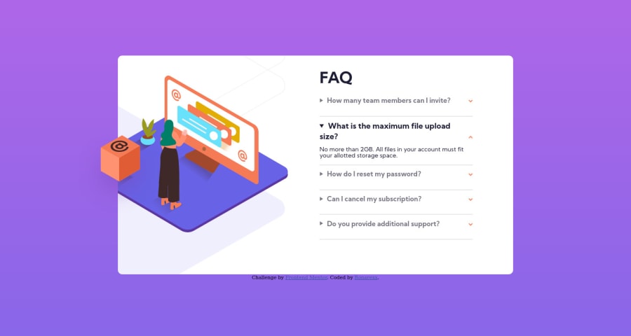
- Allowing users to scroll within the accordion (or perhaps allowing the height of the accordion to grow) so that the text content doesn't overflow the accordion when multiple tabs are opened.
- Adding a subtle
box-shadowaround the accordion (as in the original design). - Perhaps only making the titles of the FAQs bold when they are clicked on (as in the original design, as well).
Keep coding (and happy coding, too)! 😁
1@RonarexxPosted about 4 years ago@ApplePieGiraffe Thanks a lot for your feedback, i would do well to make those changes suggested.
0 - @brasspetalsPosted about 4 years ago
Overall, a good job! 👍
Just a few quick suggestions:
- adding
alttags to yourimgelements will get rid of the accessibility and html errors - adding
list-style: noneto yoursummaryshould get rid of the black arrows that show up on the left of yourdetailselements in Firefox.
1 - adding
- @RonarexxPosted about 4 years ago
Thanks a lot @brasspetals your suggestions were very helpful
0
Please log in to post a comment
Log in with GitHubJoin our Discord community
Join thousands of Frontend Mentor community members taking the challenges, sharing resources, helping each other, and chatting about all things front-end!
Join our Discord
