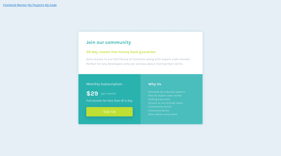
Design comparison
Solution retrospective
This one wasn't so bad. Any comments or suggestions about my code and the way I did things, I'd very much appreciate. Have a good day ya'll
Community feedback
- @dwhensonPosted over 2 years ago
Hey @Gareth-Moore lovely job here! š„³ The component looks great and I don't have much to add! Just a couple of small things to think about:
-
Is that a button or a link? I'm not sure of the answer, but as long as you are not deciding based on how it looks you are good! This page has a great summary and lots of useful links on this: https://css-tricks.com/buttons-vs-links/
-
Either way, it might be nice to practice adding some hover styles to the button/link, and adding "pointer: cursor". The last point is a bit controversial for a button, but I think most sites add it. Both of these are just to give the user some hints that they can click.
But as above, small point and lovely job! Keep it up and good luck with the next one!
Cheers š
Dave
Marked as helpful0@Gareth-MoorePosted over 2 years ago@dwhenson Thanks a ton, I read the article and that is quite a useful piece of information to know. I'm busy with other projects now but I'd change it to a link now as it'd be going to a new page (most probably) rather than some interactivity on the page.
Again, thanks Dave!
Gareth
1 -
Please log in to post a comment
Log in with GitHubJoin our Discord community
Join thousands of Frontend Mentor community members taking the challenges, sharing resources, helping each other, and chatting about all things front-end!
Join our Discord