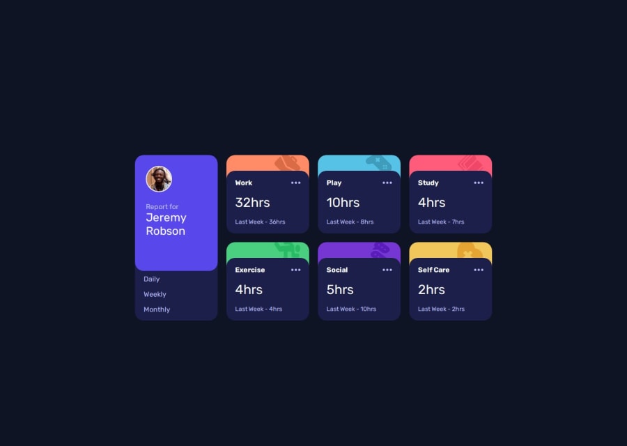


Design comparison

Solution retrospective
I’m proud of my attention to details, I couldn’t even differentiate between my work and the original task (lol).
What challenges did you encounter, and how did you overcome them?Deploying the project to vercel was hell. I was like, I’ve done this before, why isn’t it working? I didn’t know the name of my html file MUST BE index.html, until I asked my teammate (in the cohort where we were assigned this task)
What specific areas of your project would you like help with?Making my work responsive!!! I’ve copied my code and tried it on different editors, even hosting on VScode live server, and it’ll be responsive. But once I deploy it on vercel, it’ll only show desktop view. How do I fix this?
Community feedback
- @khatri2002Posted 2 months ago
Hi @OffixialTrust!
The developed solution looks good!
1. Ensure Responsiveness with Viewport Meta Tag
As you mentioned, the solution is not responsive, even with breakpoints in place. This can be fixed by adding the following in the
<head>tag:<meta name="viewport" content="width=device-width, initial-scale=1.0">Purpose of the Viewport Meta Tag:
- The viewport defines the visible area of a webpage on a device.
- On mobile devices, browsers render web pages as if they are displayed on a larger screen (usually 980px wide) and scale them down.
- This behavior makes non-responsive websites appear usable.
- The
<meta name="viewport">tag informs the browser to control the page's dimensions and scaling, ensuring that breakpoints work effectively and the webpage is responsive.
Adding this tag will make your breakpoints functional, ensuring your website adapts to different device sizes properly.
2. Remove Unnecessary Vertical Scrolling
Your webpage currently has unnecessary vertical scrolling in the desktop resolution, even though the content is minimal. This is caused by using:
margin: 25% auto 25% auto;in the
.maindiv to center the content.Instead of using margin to center the content, consider this modern approach:
body {
    margin: 0;              /* Removes default browser margin */
    min-height: 100vh;      /* Ensures the body takes up the full height of the viewport */
    display: flex;          /* Enables flexbox for centering */
    justify-content: center; /* Horizontally centers the content */
    align-items: center;    /* Vertically centers the content */
}
This approach ensures the content is centered without creating unnecessary vertical scrolling. You can remove the margin applied to
.main.3. Use
buttonInstead ofpfor Clickable TextCurrently, the text labels "Daily," "Weekly," and "Monthly" are rendered using the
<p>element. While this works, it is not semantically correct because these are interactive elements.Why Use
buttonInstead?- Accessibility: Buttons are naturally focusable and come with built-in keyboard navigation (e.g., pressing "Tab" and "Enter").
- Semantics: Buttons communicate intent to perform an action (e.g., triggering a click event), whereas
<p>elements are purely for displaying text. - Usability: Buttons provide better support for screen readers and other assistive technologies, enhancing the overall user experience.
The overall solution is fantastic! Keep up the great work! 🚀
Marked as helpful1@OffixialTrustPosted 2 months ago@khatri2002 Thank you sooooo much for this! I’ve worked on it. (But vercel is still giving desktop view)
0@khatri2002Posted 2 months ago@OffixialTrust
You've misspelled
name="viewport"asname="veiwport". Kindly correct it.1@OffixialTrustPosted 2 months ago@khatri2002 Thank you so much, I'm really grateful, I can't thank you enough!
1

Please log in to post a comment
Log in with GitHub
Join our Discord community
Join thousands of Frontend Mentor community members taking the challenges, sharing resources, helping each other, and chatting about all things front-end!
Join our Discord