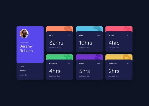
A time tracker dashboard.

Solution retrospective
I am proud in general of this project, it's a stepping stone of coming projects that will need to be professional and wrote in with a deadend limit. And I would do the JS better next time I have better understanding of DRY coding, but for now this is my solution... 😊
What challenges did you encounter, and how did you overcome them?I did the project normally (large screen and then phone), but it didnt work well, the layout would jump when I change the window's width... but when I built the other way around in turned out great. in the end it's just how to think out of the problem and keep calm... dont panic. 👌
What specific areas of your project would you like help with?I would love a rewrite of JS with a DRY code that doesn't have alot of repeats of same code doing same thing... but overall any advices are welcomed. 😁
Please log in to post a comment
Log in with GitHubCommunity feedback
No feedback yet. Be the first to give feedback on Caelus's solution.
Join our Discord community
Join thousands of Frontend Mentor community members taking the challenges, sharing resources, helping each other, and chatting about all things front-end!
Join our Discord