
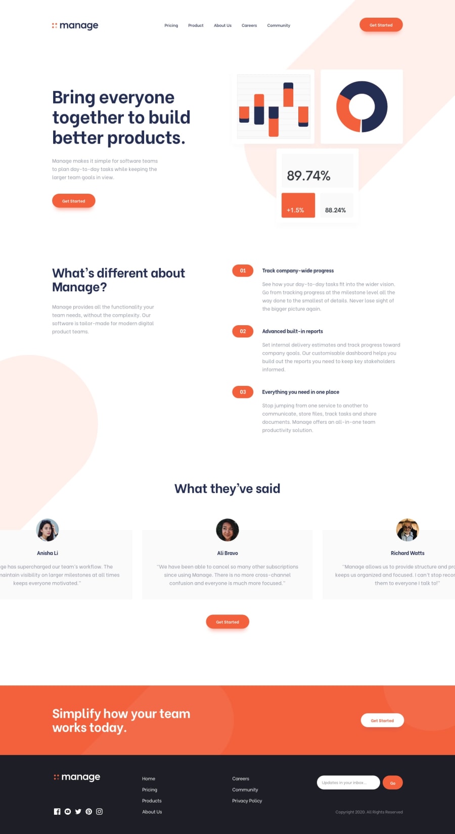
a stunning, responsive landing page for Manage using CSS


Design comparison
Solution retrospective
Completing this task.
What challenges did you encounter, and how did you overcome them?the mobile toggle but i was consistent in trying.
What specific areas of your project would you like help with?in all areas i am found wanting i am open to learning.
Community feedback
- @michelNicePosted 4 months ago
Hi everyone,
I’m working on a responsive navigation layout and could use some assistance. Here’s what I’m aiming for:
On desktop: The logo should be on the left, and the navigation should be on the right side with the shopping cart as the last item in the navigation list. On mobile: The logo remains on the left. There should be a shopping cart icon in the center, and a clickable hamburger menu that changes to a close "x" when clicked. When the hamburger menu is clicked, the navigation should slide down from the top. You can check out my current setup and what I’m working towards through the following links:
GitHub:https://github.com/michelNice/Partiu-Russia
my website: https://nimble-genie-a7cc7e.netlify.app/
what I am trying to do: my website:https://partiurussia.com.br/
Any help or guidance on achieving this would be greatly appreciated!
Thanks!
0

Please log in to post a comment
Log in with GitHub
Join our Discord community
Join thousands of Frontend Mentor community members taking the challenges, sharing resources, helping each other, and chatting about all things front-end!
Join our Discord