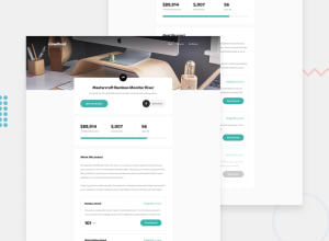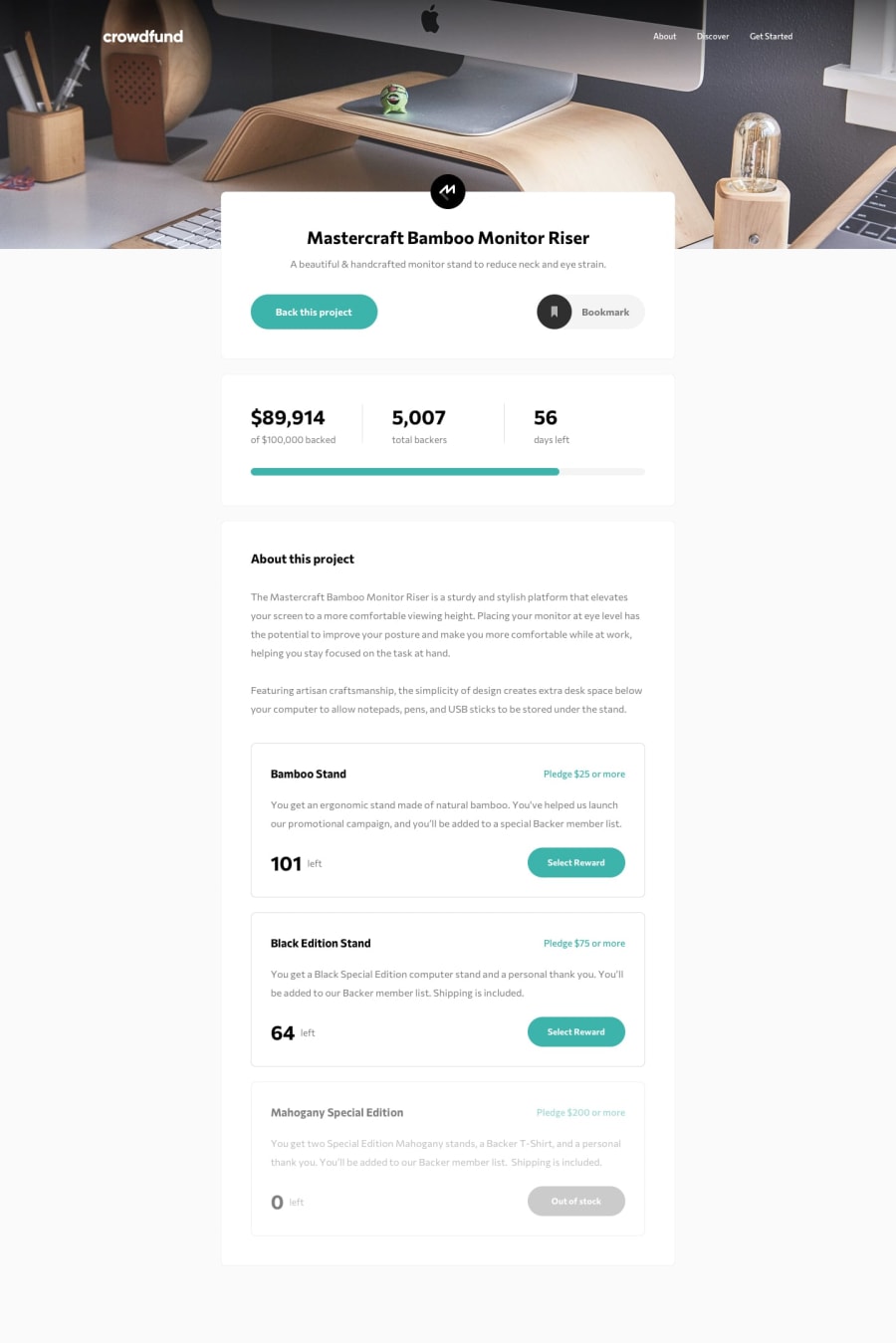
Design comparison
Solution retrospective
I welcome any feedback to make the site better. Thanks!
Community feedback
- @ApplePieGiraffePosted about 2 years ago
Hello, Kellen Ruyle! 👋
Great work on this challenge! 👍
One or two small suggestions I have are,
- Adding
cursor: pointerto some of the elements inside the modal (such as the radio buttons and the close button) to let users know those elements are clickable. - Triggering the modal when one of the "Select reward" buttons are clicked (not just the "Back this project" button) as I believe that's the intended functionality of the site.
- Perhaps looking into using a preprocessor such as Sass for your next project. It'll add superpowers to your CSS (through features like nesting and functions) which will help reduce the number of styles you have and make writing and organizing CSS a little easier (especially for larger projects such as this one).
Hope you find these suggestions helpful. 😊
Keep coding (and happy coding, too)! 😁
2@rule-kellsPosted about 2 years ago@ApplePieGiraffe Thanks so much for the feedback! Yeah, originally had the modal display when clicking the "select reward" buttons but wasn't sure, so I changed it. Hmm, I thought I did add
cursor: pointerI might take a look at that again. Thanks for making me aware. And yes, Sass, as well as React, are the next things I am going to focus on. Thanks again!1@ApplePieGiraffePosted about 2 years ago@rule-kells
No problem! Glad to help! 😊
0 - Adding
Please log in to post a comment
Log in with GitHubJoin our Discord community
Join thousands of Frontend Mentor community members taking the challenges, sharing resources, helping each other, and chatting about all things front-end!
Join our Discord
