Not Found
Not Found
Not Found
Not Found
Not Found
Not Found
Not Found
Not Found
Not Found
Not Found
Not Found
Not Found
Not Found
Not Found
Not Found
Not Found
Not Found
Not Found
Not Found
Not Found

Submitted

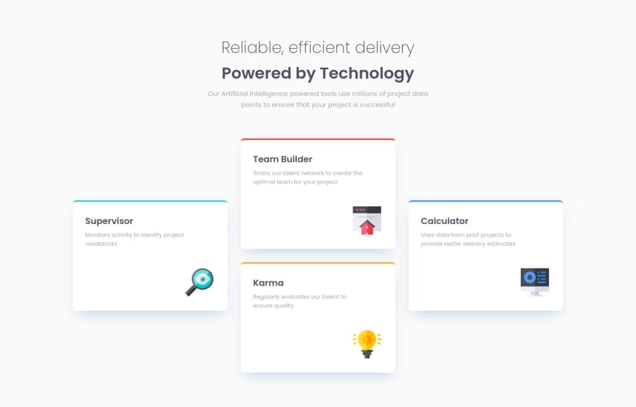
A small React app using CSS grid with a mobile first workflow

@DonHeidi

Desktop design screenshot for the Four card feature section coding challenge

This is a solution for...

  • HTML
  • CSS
1newbie
View challenge

Design comparison


SolutionDesign

Solution retrospective


Feel free to comment on this design. I added another (not requested) layout for tablets because I did not like the single column on medium sized screens. What do you think?

I have two questions:

I tried using gh-pages npm package to deploy the create-react-app via Github Pages but it failed and I used Vercel instead. Has anyone any experiences on how to deploy a react App on Github or some knowledge about any pit falls?

I liked using css grid for this task but is there another way to achieve this layout?

Community feedback

Elaine 11,400

@elaineleung

Posted

Hi Don, this looks really great, and pretty close to the original! You can probably try changing the line height of the main title to a lower number (maybe 1.2, 1,3?) so that that gap can be decreased a bit. Also I like what you did with the tablet view🙂

About your question, GH pages is meant for static pages or static page generators; with React, I've seen how some people manage to get it to work but usually with a lot of additional configuration, and in the end I think it's just better to use Vercel. I usually keep all my static stuff in my main FEM repo, and then for React I'd create a new repo that I can use for deployment on Vercel.

Once again, great job with your solution!

Marked as helpful

1

@DonHeidi

Posted

@elaineleung Thank you very much! I will have a look into the line height :)

1

@teoh4770

Posted

I think using grid is a better and easier approach here, but my first instinct on achieving this layout is to use positioning style attribute.

Firstly, at the desktop view, I set a max-height and max-width for the cards section and the cards themselves, and set the card container to relative position. Then, I position each cards with absolute positioning and translateX / Y, and adjust the position based on preview.

For example, to position the supervisor cards, I set its position value to absolute, follow by top: 50%, which set the top-left corner part of the card to the left centre of the container. Then, to make sure the card is positioned exactly at the centre, I use transform: translateY(-50%) to position the card itself up of its own height.

Follow by the same logic, you do the same thing to each of the cards, and you would eventually achieve the same layout.

Best, Chee Kian Teoh

0

Please log in to post a comment

Log in with GitHub
Discord logo

Join our Discord community

Join thousands of Frontend Mentor community members taking the challenges, sharing resources, helping each other, and chatting about all things front-end!

Join our Discord