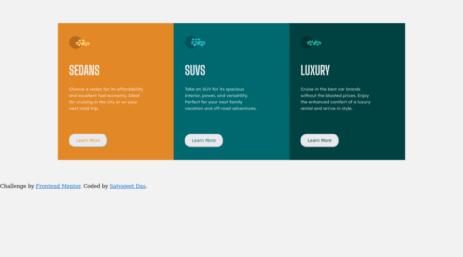
A single page 3 column grid layout using HTML and CSS flexbox
Design comparison
Solution retrospective
I still couldn't understand why doing align items my contents are not vertically centered. how can i vertically center my whole container and please suggest changes in the code on how can i make the page responsive ,some links from where i can learn how to make this website responsive.
Community feedback
- @vanzasetiaPosted over 2 years ago
Hi, Satyajeet! 👋
To make the card vertically center (and horizontally center), I recommend making the
bodyelement as a flex container. I also highly suggest usingvhunit for themin-heighton thebodyelement. This way, the cards would always be in the middle of the page regardless of the user screen sizes.I suggest never using
%formarginandpaddingbecause%will make those values become too large or too small depending on the user screen size. Unlikewidthwhere there'smax-widthso, you can limit how much it should grow,paddingandmargindon't havemaxproperties. So, my recommendation is to use theremunit formarginandpaddingfor the consistent result (and great for responsiveness as well).For responsiveness, I recommend writing the styling for the mobile layout first (known as the "mobile-first" approach). It often leads to shorter and better performance code. Also, mobile users won't be required to process all of the desktop styles. Also, for the media query units, I recommend using
emunit for consistent results across multiple browsers. Here are the articles on both topics.That's it! I hope this information is useful! 😁
1
Please log in to post a comment
Log in with GitHubJoin our Discord community
Join thousands of Frontend Mentor community members taking the challenges, sharing resources, helping each other, and chatting about all things front-end!
Join our Discord
