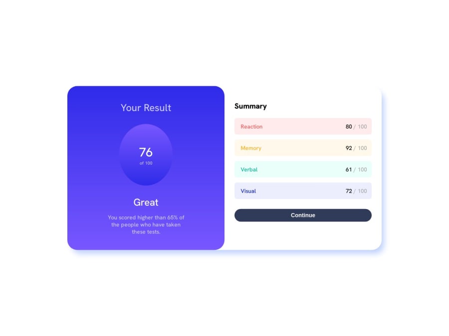
A simple responsive Result Summary Component using HTML and CSS


Design comparison

Solution retrospective
This is the very first project that I have worked on, so if I made any mistake that seems silly, please forgive me for that. The problem that I faced when building this component was mainly for the responsive design.
1.) When I was designing the component for a device whose screen size was 375px and below, the 'result-component' or the purple section (for ease of understanding) of the component had the upper half portion hidden. Now I found a quick workaround for that by adjusting the top position of the component but, it affected some devices whose size was slightly greater than 375px. Although the effects were pretty minor, I would love to see a more optimized solution for this problem.
2.) I would love to get some feedback on my code quality and would love to know if there was a better way to solve this problem or not. Also, I will be grateful to get my hands on some resources that can help me to improve my code quality.
3.) I would also love to get an opinion on how to write better README files for the projects.
Community feedback
- @i-am-vahidPosted about 1 year ago
Hello Aayush Jha I checked your code and I will write some tips for you to make this design more beautiful
Place all the components in a main element like And give the main element a height of 100vh so that it covers the entire page Also, use flex to center the inner elements
main{
height :100vh;
display:flex;
  align-items:center ;
justify-content:center;
}
With this, you don't need position anymore and it will be fully responsive in the center. Use the maximum width instead of the width and set its unit to vw so that it will be enlarged according to the width of the screen in most displays
#result-summary-body {
  display: grid;
  grid-template-columns: 1fr 1fr;
max-width:45vw
}
Instead of using a lot of padding & margin, try to use display flex and gap for parent.
.result-component{
display: flex;
  flex-direction: column;
  align-items: center;
}
if you want use padding use it for parent element.
.result {
  display: flex;
  align-items:center ;
justify-content:center;
width: 10rem;
 height: 10rem;
border-radius:50%;
}
To learn better, you can use the videos of Kevin Powell's YouTube channel or the website freecodecamp
Be successful and hardworking
Marked as helpful0@Aayush895Posted about 1 year ago@i-am-vahid Thanks for the positive feedback brother. It was really helpful and I will try to implement your solutions. Cheers brother.
0 - @EduardoLimaCastroPosted about 1 year ago
Hello Aayush Jha,
in your css change the value of top:68% to top:80% in your mobile mode
@media (max-width: 820px) {
  #result-summary-body {
    display: grid;
    grid-template-columns: repeat(1, auto);
    width: 100%;
    top: 68%;
    border-radius: 0;
  }

  .result-component {
    padding: 2rem;
  }
}
Marked as helpful0@Aayush895Posted about 1 year ago@EduardoLimaCastro First of all thank you for the feedback brother but, when I tried your solution, the shift in position for different devices which were slightly greater than 375px was too much as compared to the position of 68%.
0


Please log in to post a comment
Log in with GitHub
Join our Discord community
Join thousands of Frontend Mentor community members taking the challenges, sharing resources, helping each other, and chatting about all things front-end!
Join our Discord