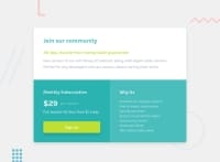
Design comparison
Solution retrospective
My third build-up. 🙂 ... how set the media queries responsive for both mobile and pc resolutions using media queries (min-width: )/(max-width) with (min-height: )/(max-height) ? I used only one property [ only (min-width: ***px ) ] in med.q.s for this. How ever if I used both the page brakes. can we use transform:scale for this? ~Thankyou~
Community feedback
- @AgataLiberskaPosted over 3 years ago
Hi @M-lakshan! Your solution looks fantastic at 1440px, but on my larger screen the card is not centered, and on a smaller screen, the right part of it is cut off (the content overflows the card and is hidden). Instead of hard-coding margins on the body, you can use flexbox or grid to center the card on the screen.
Not sure if I understand your question but in theory, you'd set `@media (min-width) and (min-height), although I don't think you need that in this case :)
0@M-lakshanPosted over 3 years ago@AgataLiberska Ahaa.. I asked that how can we use both height and width sizes in a med.querie ( like #@media_screen_and_(min-width: 375px)and(min-height:800px){ } , but I only used width property for this built. whenever I used both the page is not responsive. ). Thanks Agata 💪🏼🙂🥂, I'll do the flex alignment in my next preparation. btw another thing, >> according to my question I saw a thing in a media querie tutorial that if we used 'em' sizes instead of 'px', 'pt' sizes we can transform our scale (ems automatically converts to pixels) to any resolution with the help of given pixel ratio. Is it possible? I haven't done that yet. As I remember the tutorial is from the YouTuber CODER CODER but I'm not sure it is for media queries or for something else...
0
Please log in to post a comment
Log in with GitHubJoin our Discord community
Join thousands of Frontend Mentor community members taking the challenges, sharing resources, helping each other, and chatting about all things front-end!
Join our Discord

