A simple multi step form built with React.
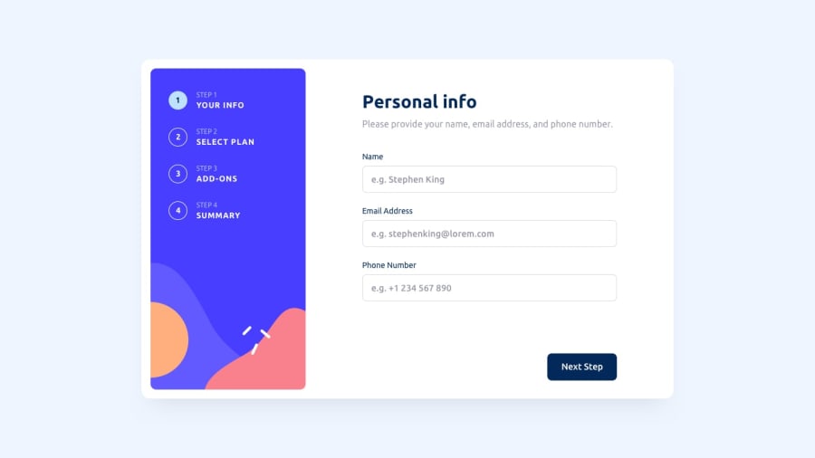
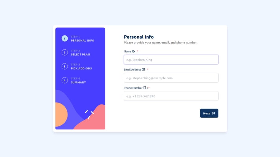
Design comparison
Solution retrospective
...
Hello FEM Community!😉
this is my solution for multi step form app challenge!😊.
I'm thrilled to share my solution for the multi step form app challenge, and building this app was a fantastic learning experience that solidified my understanding of React's core concepts.
🛠️ Built with:
- React✔
- Tailwind ✔
- TypeScript✔
- Framer Motion ✔
- Daisy UI ✔
Check out the live demo and feel free to leave any feedback or ask questions about my approach! Thanks a lot😊.
Community feedback
- @MizanSafinPosted about 1 month ago
Very nice design I love it brother . There is some place you have most probably changed frontEndMentor original design like next button
Marked as helpful0 - @ZahirHaniche-devPosted 3 months ago
Congratulations on your very comprehensive project. I really like your project architecture and the way you managed the form steps. I have just submitted a solution that I will improve little by little because there are still things missing.
Once again, congratulations my friend and good luck!
Marked as helpful0@Mahmoud-ElagamyPosted 3 months agoCongratulations on your excellent project! Thanks alot for your feedback.
0 - @VictorKevzPosted 3 months ago
I love your simple animations 😁, which I honestly could adopt for my project! Also, the icons' appearance on successful form registration was a nice touch!👌🏼
However, I think there are just minor details you may have missed like preselected or default options on both subscriptions and adds-on. It's good that you set validation in case it's not selected but I thought I could just mention that in case it wasn't intentional. Above all, I love your solution!!!!
Marked as helpful0@Mahmoud-ElagamyPosted 3 months agoI thought for a while about default options and decided to make plans required but without preselected any and left it to the user because it is about money 😄 and the experience he will get, and add-ons i made it optional and provide a text if nothing picked to encourage the user to pick a one, finally I appreciate your feedback, thanks alot 🤍.
1 - @UzomaFidelisPosted 3 months ago
Wow, I love your solution. Love the personal touch you gave to the challenge design. I on the other hand usually try to follow the design files too closely 😂😂. Maybe not such a good idea after all. Nice work again!
1@Mahmoud-ElagamyPosted 3 months agoThe principle is that I stick to the design provided because the person who designs is usually a specialist, but this does not prevent me from sometimes not liking the design and modifying it a little until it is more suitable for me.Thanks for your feedback.
0
Please log in to post a comment
Log in with GitHubJoin our Discord community
Join thousands of Frontend Mentor community members taking the challenges, sharing resources, helping each other, and chatting about all things front-end!
Join our Discord