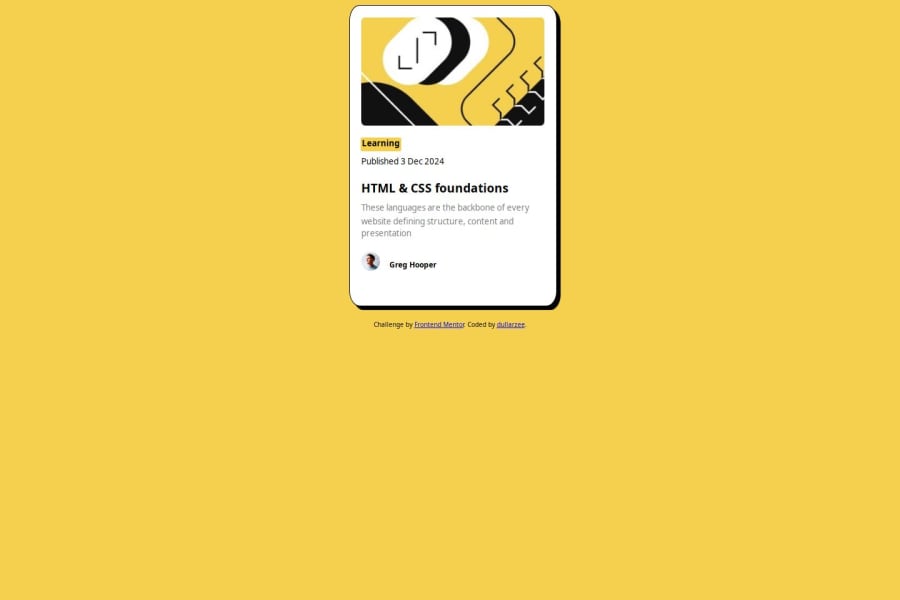


Design comparison

Solution retrospective
i got to know of svg but it was short lived because the use of it became frustrating and i had to revert back to pure html
What challenges did you encounter, and how did you overcome them?a lot with having to render my site properly on mobile devices
What specific areas of your project would you like help with?how to render properly on mobile devices...ive still not gotten the answer to it even with pure html
Community feedback
- @AdrianoEscarabotePosted 4 months ago
Hi dullarzee, how are you doing? I really loved the outcome of your project, but I have a few suggestions that I think might be helpful:
Using Flexbox or Grid on the
bodyto center elements ensures a more responsive and adaptive layout, fitting different screen sizes seamlessly. It avoids manual calculations and constant adjustments needed withmargin,padding, or absolute positioning. These techniques provide more consistent alignment and simplify the code.flexbox:
body {
    display: flex;
    justify-content: center;
    align-items:  center;
    min-height: 100vh;
}
grid:
body {
    display: grid;
    place-content: center;
    min-height: 100vh;
}
The rest is excellent.
I hope you find it useful. 👍
0 - @dylan-dot-cPosted 4 months ago
Bro alot of things you are doing wrong here such as using absolute everywhere instead of making the content flow naturally. And if you used px or %s it still wont look good on all screen sizes
Best thing to do is start over, structure ur html code better than go back to css, user grid/flex to center and use css properly to style your stuff.
Feel free to check out my solution and others as well ask more questions if you would like.
0


Please log in to post a comment
Log in with GitHub
Join our Discord community
Join thousands of Frontend Mentor community members taking the challenges, sharing resources, helping each other, and chatting about all things front-end!
Join our Discord