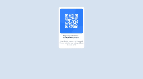
Not Found
Not Found
Not Found
Not Found
Not Found
Not Found
Not Found
Not Found
Not Found
Not Found
Not Found
Not Found
Not Found
Not Found
Not Found
Not Found
Not Found
Not Found
Not Found
Not Found

Submitted

A responsive web HTML5 and CSS design using grid.

@PeaceNaza

Desktop design screenshot for the QR code component coding challenge

This is a solution for...

  • HTML
  • CSS
1newbie
View challenge

Design comparison


SolutionDesign

Solution retrospective


The difficulty i had while building the project was adding space on the left and right side of the <span> element.

Community feedback

Account Deleted

With the span its a inline element so margin and padding wont effect it. Either set the display to block on the span, or simply change it to a p tag. Only use span tags if you are adding something directly into a h1-h6 tag or a p tag. Otherwise you dont really ndeed to use them. Hope this helps.

Marked as helpful

1

@javascriptor1

Posted

Hi Peace,

Nice job. Here are some notes about your solution :

  • HTML

1- For HTML , always use semantic tags and avoid using generic tags like div and span as much as possible unless you have no other options. Example , instead of div tag you have used for container , use main tag and use H1 instead of P tag for the first senetence. I have opened a PR for this purpose. Please check your github repo for this project for more info.

2- Add alternative text alt to the image so you make it accessible. People with disabilities like blindess can't see images. They rely instead on screen reader to consume and interact with the content. Alt is the texts that represent the image in your page. Write a text which can express what is this photo and convey the meaning for it. For this challenge , you can use something like alt="QR code for frontend mentor website"

  • CSS

3- Media query you wrote is redudant and has no effect as its the same styling which is already applied for the container on different screen sizes. Remove it or change the style if you want to have some changes for mobile screens.

4- Another repeated styling which can be removed is the

margin-top: 4rem; for container. You have already added margin: 4rem;

5- for P tag , font-weight: 400; also can be removed as this is the default value. Same for display: block. p tag is a block level element by default.

Best of luck

Marked as helpful

0

@PeaceNaza

Posted

Thank you so much for your thorough feedback and suggestions! I will make sure to implement the recommended changes in order to improve the accessibility, structure, and efficiency of my code. Thanks again! @javascriptor1

1

@javascriptor1

Posted

Best of luck @PeaceNaza

I also forgot to add that in order to center a div or an element in the center of the page , you need to add below code to body element in your solution :

min-height : 100vh

This is needed as the height of the body is not the full height of the screen but rather the height of the content inside the body. So for example , if you add only one H1 element to the body , the height of the body would be only the height of H1 tag , not the full height of your viewport screen.

Its even better of you add the following code instead:

html , body{

min-height:100%

}

This will give better results for mobile users

Marked as helpful

0
bright 120

@bright-op

Posted

<span> is by default an inline element, meaning, you can only space a span element left and right, use: padding or margin to add spacing to left and right. To add spacing top and down, you need to use display:block

Marked as helpful

0

Please log in to post a comment

Log in with GitHub
Discord logo

Join our Discord community

Join thousands of Frontend Mentor community members taking the challenges, sharing resources, helping each other, and chatting about all things front-end!

Join our Discord