Submitted 2 months ago
A responsive stats preview card component
#pure-css

@lutfiismail52

Design comparison
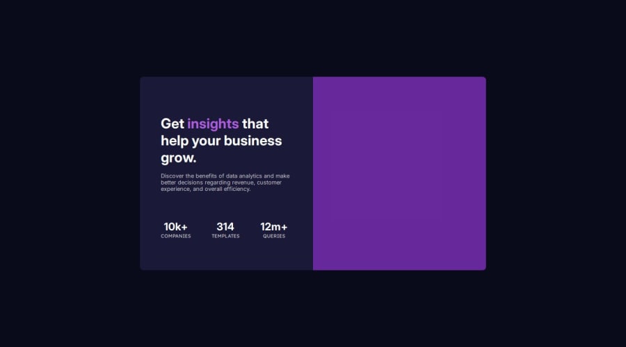
SolutionDesign

Solution retrospective
What are you most proud of, and what would you do differently next time?
I would like to try using the CSS position: relative property for a different case study.
Is my approach to displaying the header image on different screen sizes using the CSS background-color property correct? Or is there a better approach. Here is an example code:
<div class="stats-preview-card">
<div class="stats-preview-card-header"></div>
<div class="stats-preview-card-content">
<!-- other codes -->
</div>
</div>
.stats-preview-card-header {
width: 100%;
height: 240px;
border-top-left-radius: 8px;
border-top-right-radius: 8px;
background-image: url("./images/image-header-mobile.jpg");
background-repeat: no-repeat;
background-size: cover;
 background-position: center;
 position: relative;
}

.stats-preview-card-header::before {
 content: "";
 position: absolute;
 top: 0;
 left: 0;
 background-color: hsla(277, 100%, 61%, 0.50);
 border-top-left-radius: 8px;
 border-top-right-radius: 8px;
 width: 100%;
 height: 240px;
}

/* Responsive code */
@media screen and (min-width: 768px) {
 .stats-preview-card-header {
 width: 50%;
 height: 446px;
 border-top-left-radius: 0;
 border-bottom-right-radius: 8px;
 background-image: url("./images/image-header-desktop.jpg");
order: 2;
}

.stats-preview-card-header::before {
height: 446px;
border-top-left-radius: 0;
border-bottom-right-radius: 8px;
}
}
Thank you very much for your answer and explanation. I really appreciate your time and effort in helping me! 😊
Please log in to post a comment
Log in with GitHubCommunity feedback
No feedback yet. Be the first to give feedback on Lutfi Ismail's solution.
Join our Discord community
Join thousands of Frontend Mentor community members taking the challenges, sharing resources, helping each other, and chatting about all things front-end!
Join our Discord