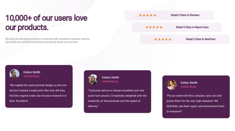
Design comparison
Solution retrospective
I am most proud of the design I made for the middle screens (iPads). There was no design for those screens given, so I made the design for them.
What challenges did you encounter, and how did you overcome them?The thing that challenged me the most was setting the SVGs as a background. It was completely new for me, so I had to look it up on YouTube, and still, I didn't do a good job at it. I don't know why, but the SVGs disappeared on mobile devices, even though I gave display: none to the desktop SVGs. Another challenge for me was to make the social boxes a little bit upwards, so I just gave margin-top and margin-bottom. I don't know if that is the best way to make them, but I made it anyway.
What specific areas of your project would you like help with?I need help setting SVGs as the background. I always struggle with that, and I also need help with these specific types of layouts where some boxes have weird movement compared to the others.
Community feedback
Please log in to post a comment
Log in with GitHubJoin our Discord community
Join thousands of Frontend Mentor community members taking the challenges, sharing resources, helping each other, and chatting about all things front-end!
Join our Discord
