Submitted about 2 years ago
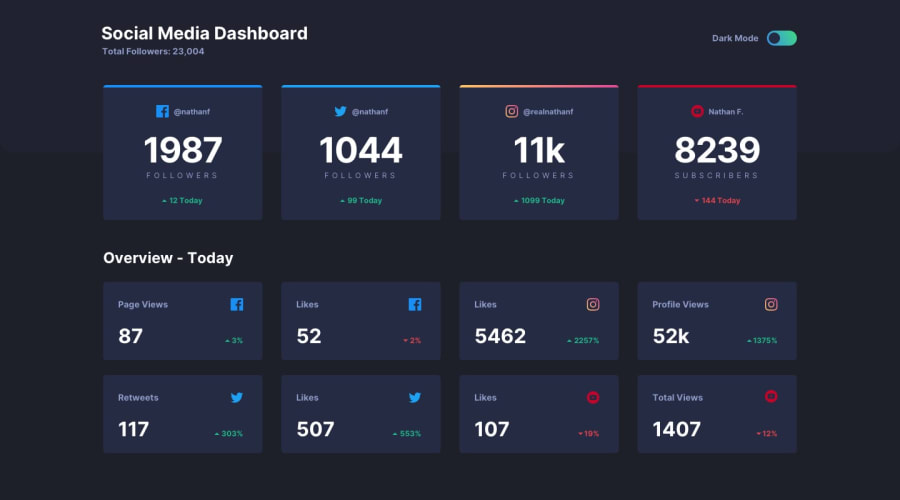
A responsive social media Dashboard w/ Raw HTML/CSS and a bit of JS
@Laure-Riglet
Design comparison
SolutionDesign
Solution retrospective
The linear gradients were kind of tricky, especially for the dark mode toggle button. It makes the CSS stylesheet a bit messy. Also, the approximate selectors' names don't help too much on that matter. I really would have liked to test it with PHP with real data (but I may try that later).
Community feedback
- @Daniel3-14Posted about 2 years ago
Wow, the fact that you can assign new colors to the existing variables in a .dark-mode class makes my solution seem wayyy more complicated than it needs to be. I did a whole bunch of needless stuff in javascript for dark mode.
Good job! I'm glad I saw this and learned something useful.
0
Please log in to post a comment
Log in with GitHubJoin our Discord community
Join thousands of Frontend Mentor community members taking the challenges, sharing resources, helping each other, and chatting about all things front-end!
Join our Discord
