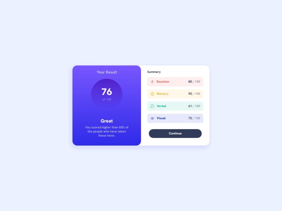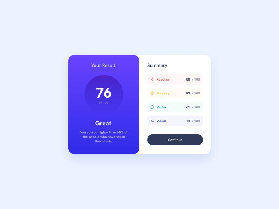
Design comparison
Solution retrospective
Turned out quite well
What challenges did you encounter, and how did you overcome them?One main difficult challenge was to have different background colors for those different summary categories and also to change the color of their text accordingly.
I used a silly hack, I declared an id in each of the classes, to change the background color, and for the text, I declared separate classes in their respective attribute.
What specific areas of your project would you like help with?I would love to know your opinion. How would you have done it differently (with only CSS)?
HTML Code:
    ...


                Reaction

            80 / 100

          ...continued
CSS Code:
....
    card__summary-categories{
    display: grid;
    grid-template-columns: 1fr;
    gap: 1rem;
}
.categories{
    display: flex;
    flex-direction: row;
    justify-content: space-between;
    align-items: center;
    border-radius: 0.5rem;
    width: 100%;

    padding: 0.8rem 1rem;
}

.categories-name{
     display: flex;
     flex-direction: row;
     justify-content: center;
     align-items: center;
     gap: 0.75rem;
     font-weight: var(--fw-medium);
}
.categories-name .Reaction {
    color: var(--clr-primary-red);
}
.categories-name .Memory {
    color: var(--clr-primary-yellow);
}
.categories-name .Verbal {
    color: var(--clr-primary-green);
}
.categories-name .Visual {
    color: var(--clr-primary-blue);
}
#c1{
    background-color: hsla(0, 100%, 67%, 0.1);
}
#c2{
    background-color: hsla(39, 100%, 56%, 0.1);
}
#c3{
    background-color: hsla(166, 100%, 37%, 0.1);
}
#c4{
    background-color: hsla(234, 85%, 45%, 0.1);
}
.categories span{
    font-weight: var(--fw-medium);
    color: var(--clr-dark-gray-blue);
    opacity: 0.5;

}
...
Please log in to post a comment
Log in with GitHubCommunity feedback
No feedback yet. Be the first to give feedback on Shiv's solution.
Join our Discord community
Join thousands of Frontend Mentor community members taking the challenges, sharing resources, helping each other, and chatting about all things front-end!
Join our Discord
