A responsive recipe page built with Tailwind CSS.


Design comparison

Solution retrospective
I am proud to have used Tailwind CSS for the first time and to have made the responsive design all by myself! By using the Tailwind CSS CDN, I was able to build this interface much more easily. A little example 😃? Here you go 🙂!
Tailwind CSS CDN
<script src="https://cdn.tailwindcss.com"></script>
Here, the image styling with Tailwind CSS classes:
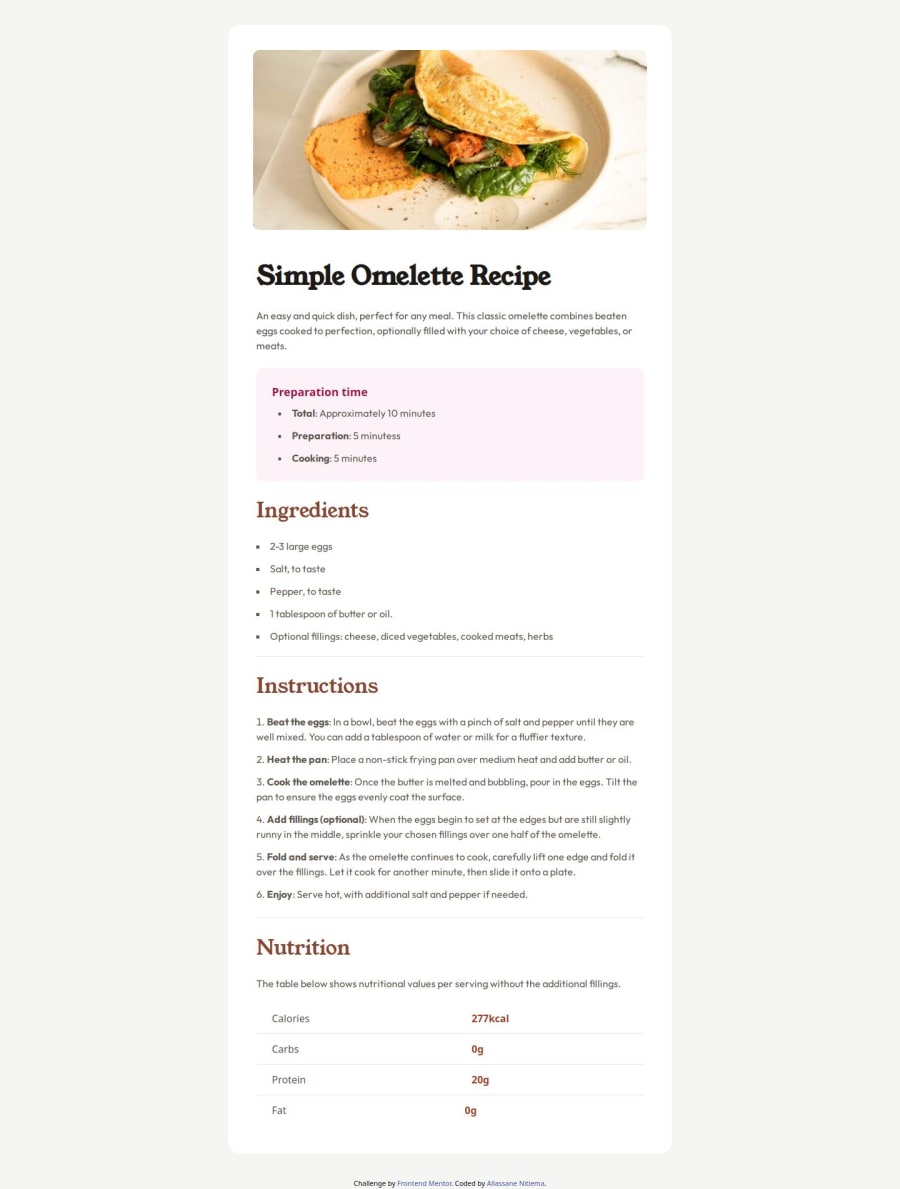
What challenges did you encounter, and how did you overcome them?<div class="w-[100%] h-[100%] md:overflow-hidden md:px-[40px] md:pt-[40px] "> <img src="./assets/images/image-omelette.jpeg" alt="Omelette image" class="w-[100%] h-[100%] object-cover md:rounded-[10px]"> </div>
My challenge was the responsive design with Tailwind CSS. I overcame it thanks to the Tailwind CSS documentation, of course.
What specific areas of your project would you like help with?My code works, but I always wonder if I followed best practices. I would love to receive feedback on my code and suggestions for improvement. Thanks in advance, and good luck to all of us!
Community feedback
- @AldikrasniqiPosted about 1 month ago<div class="w-[100%] h-[100%] md:overflow-hidden md:px-[40px] md:pt-[40px] "> <img src="./assets/images/image-omelette.jpeg" alt="Omelette image" class="w-[100%] h-[100%] object-cover md:rounded-[10px]"> </div>
w-full is the same as w-[100%], that goes same to height. try to use units by default from tailwind https://tailwindcss.com/docs/padding the rem is better than px and other units.
Marked as helpful1


Please log in to post a comment
Log in with GitHub
Join our Discord community
Join thousands of Frontend Mentor community members taking the challenges, sharing resources, helping each other, and chatting about all things front-end!
Join our Discord