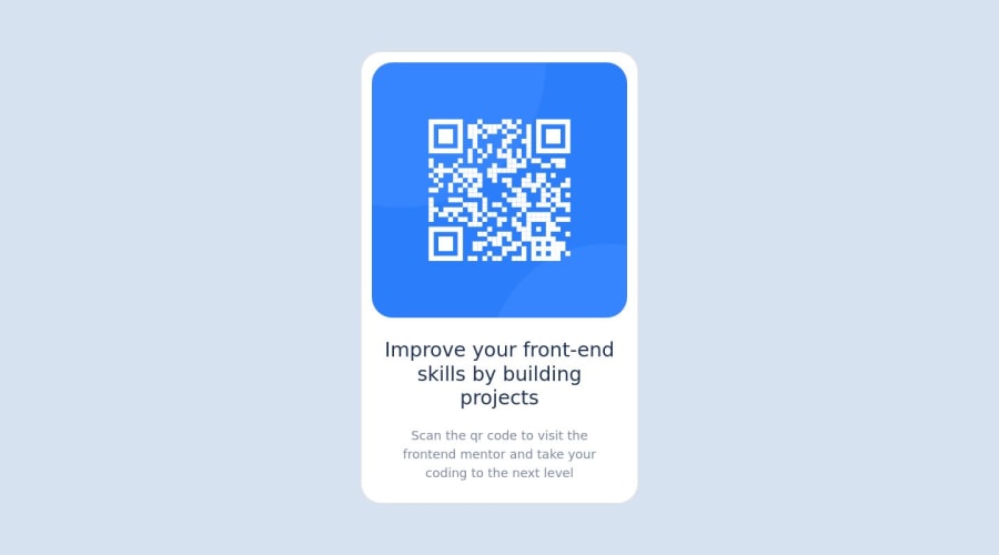
Design comparison
SolutionDesign
Solution retrospective
Any ideas and corrections are welcomed
Community feedback
- @Mennatallah-HishamPosted about 1 year ago
Hi Anthony, You did great 👍
Here are some suggestions to improve your code:
Semantic HTML
- wrap your content in <main>,this element represents the dominant content of the <body>
- wrap your card in <article>
<main>
<article>
</article>
<div>
</div>
</main>
ALT
- images should have descriptive alt text, which is important for SEO and screen reader users,alt="QR code linking to Frontend Mentor challenges"
SEO
- you can add meta description for better SEO, it provides a brief summary of a web page
<meta name="description" content="..........."/>here are some helpful articles:
Hope you find this helpful, Happy Coding
0 - @gfunk77Posted about 1 year ago
Your solution looks great. One thing I would suggest is adding the google font provided in the style guide. It’s really easy to do if you are not familiar:
- Click on the link which takes you to Google fonts page.
- select the font weight indicated
- click on the icon on the top right
- copy the link given in the right side panel as you scroll down
- paste that link into your html with all the others
- copy the font family and put that in the css
After that you have added your fonts!
Nice job on your QR code
0
Please log in to post a comment
Log in with GitHubJoin our Discord community
Join thousands of Frontend Mentor community members taking the challenges, sharing resources, helping each other, and chatting about all things front-end!
Join our Discord
