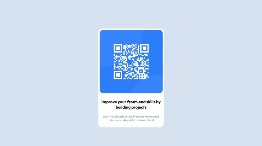
Design comparison
Solution retrospective
I'm most proud of just simply starting this project, and most particularly this platform. Although I've known about it for a really long time, I'm just starting this now. As for this particular component, I'm proud of making it, within my estimated time range.
As for the next time onwards, I'll draw a rough wireframe of the component/site before its coding. Coz this time, I had a little rough start coz of not doing it.
What challenges did you encounter, and how did you overcome them?As it was the 1st challenge, this one wasn't hard per say. But as I mentioned earlier, I had a little rough start coz of not making the rough wireframe before going on with the code part.
I overcame this challenge by screenshooting the desktop version design and then using it for reference, multiple times.
What specific areas of your project would you like help with?I would appreciate reviews and feedback on my code, like the better/shorter/more efficient method for the functionality, and regarding the responsive part of my design as well.
Community feedback
- @Sonu-DuttaPosted 9 months ago
Hey! Good solution, I would like to suggest you to use
display: flexproperty. You can get more information on this from -> https://www.w3schools.com/css/css3_flexbox_container.asp0 - @HummingcoderPosted 9 months ago
Give the card padding of 1rem(16px) or more, and give the card a width of 375px and 90% width for screens smaller than 375px.
0
Please log in to post a comment
Log in with GitHubJoin our Discord community
Join thousands of Frontend Mentor community members taking the challenges, sharing resources, helping each other, and chatting about all things front-end!
Join our Discord
